Pryme
Pryme Beef Jerky
Packing heat.
With demand rising for high protein, health conscious snacks, a newly conceived Australian beef jerky brand needed a bold identity to stand out in a crowded category.
Challenge
The task was to attract a new generation of snackers by delivering a modern, exciting twist on traditional jerky. B! Brand was engaged to define the brand’s punchy personality and hero bold flavours, all while positioning it as a health conscious option that challenges the mainstream.
Solution
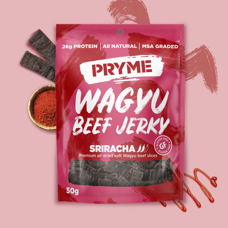
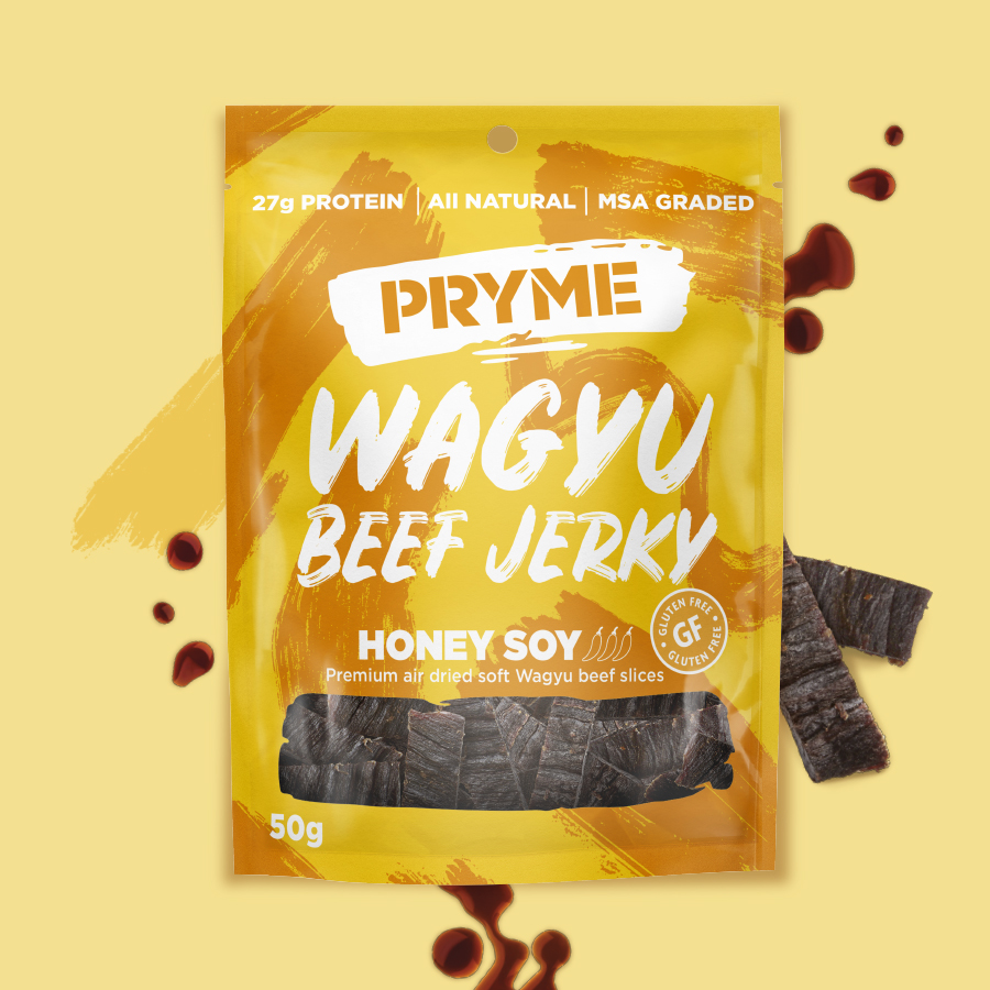
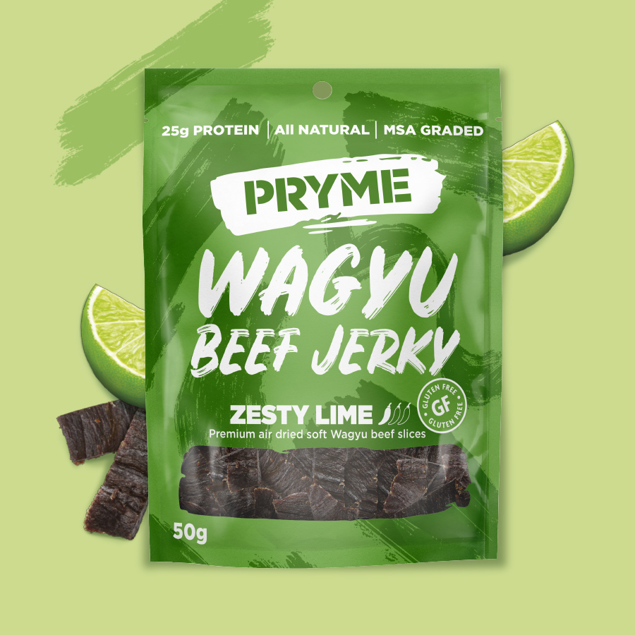
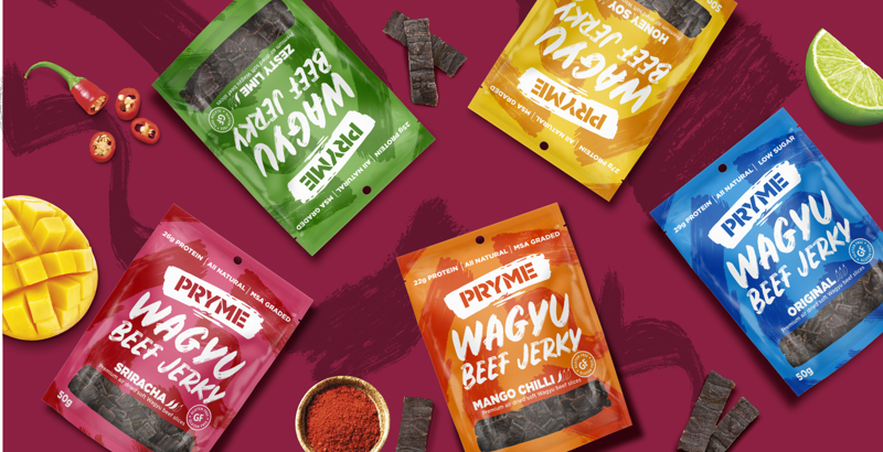
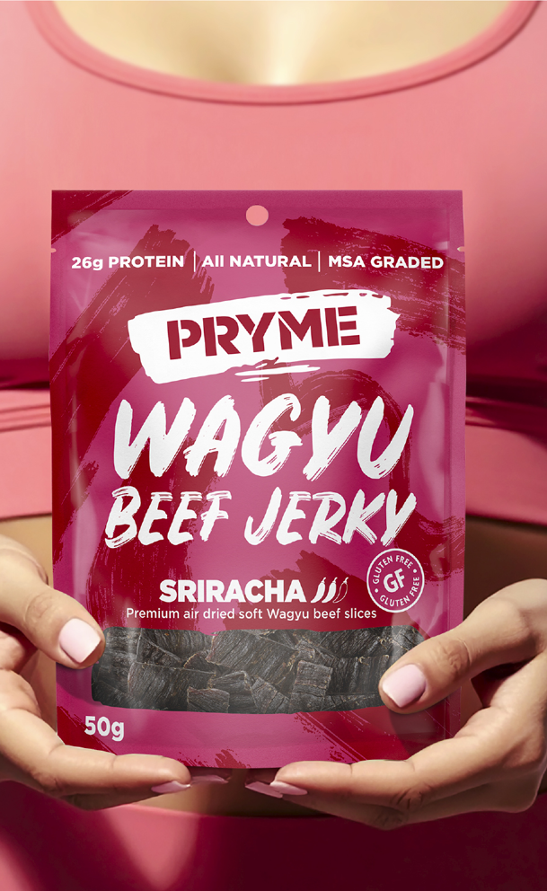
B! Brand used vibrant colours and a dynamic visual language to inject energy, while bold typography reinforced branding and quality. A transparent window and clear icons communicated key product attributes, including flavour, heat level and health claims, enhancing shelf standout and clarity.
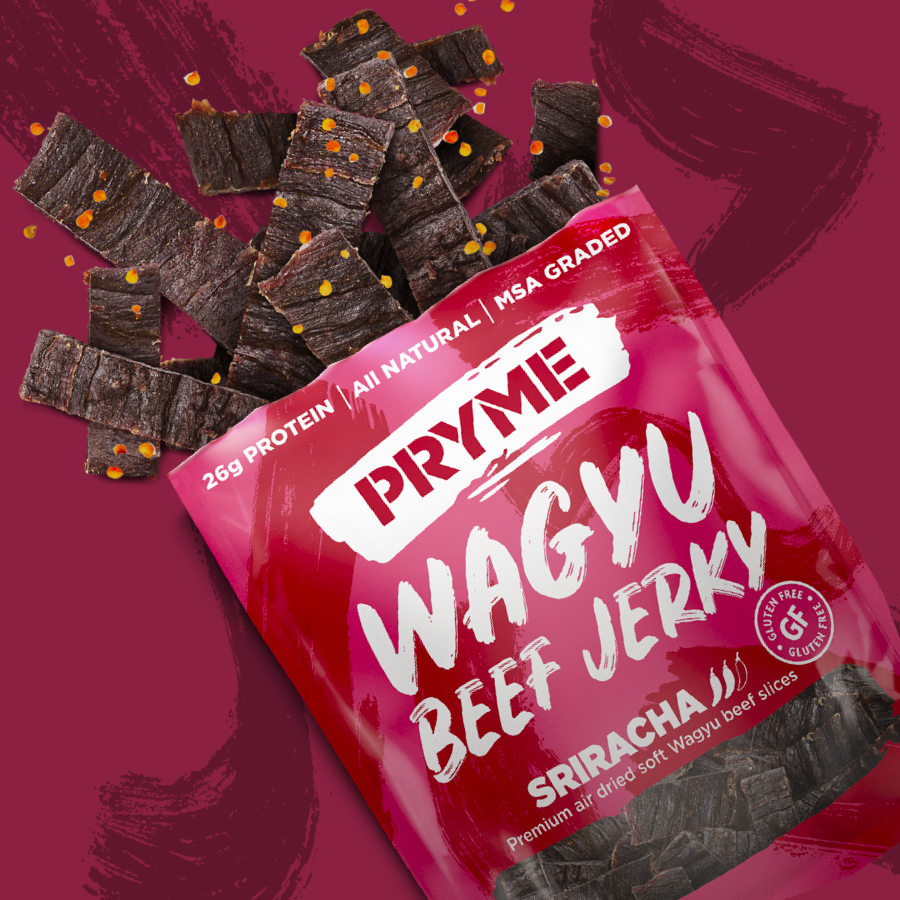
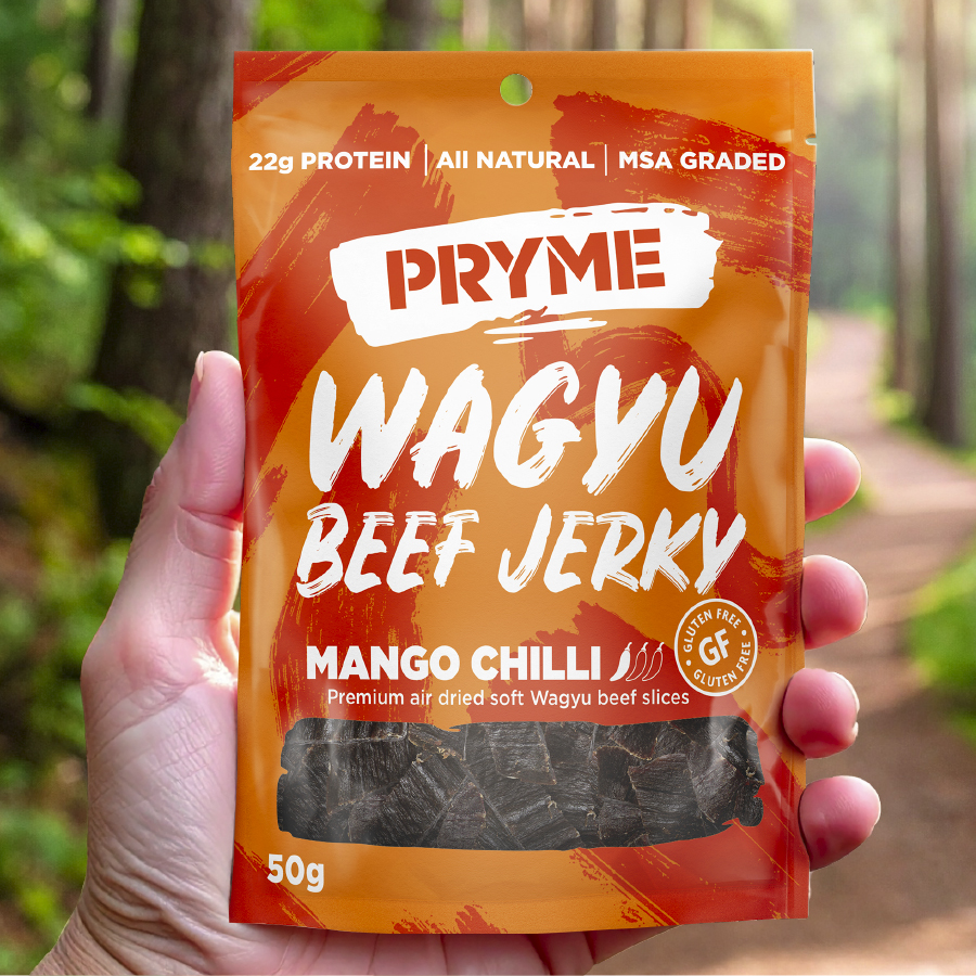
Using our brand building blocks we created a bold identity to elevate Pryme Beef Jerky’s visibility and appeal in the snacking category:
B Clear
Clear product messaging and bold flavour cues ensured instant shelf recognition and consumer understanding.
B Relevant
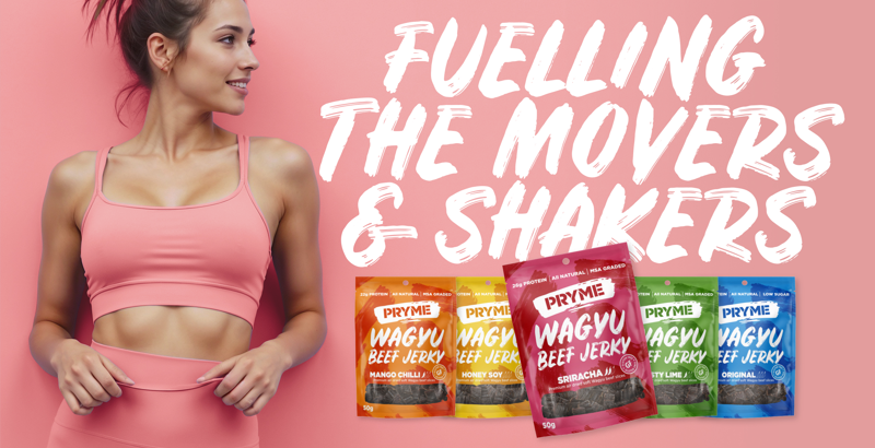
Design and tone were crafted to appeal to modern snackers, tapping into health-conscious behaviours and a desire for adventurous flavours.
B Consistent
A strong visual identity and brand voice were applied consistently across pack formats, reinforcing recognition and building trust.
