Ovaltine
Ovaltine
Waking a Sleeping Giant.
Ovaltine needed to awaken its iconic brand legacy within Australian households.
Challenge
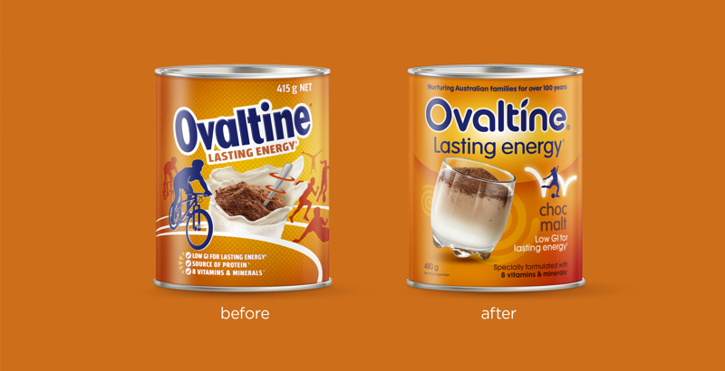
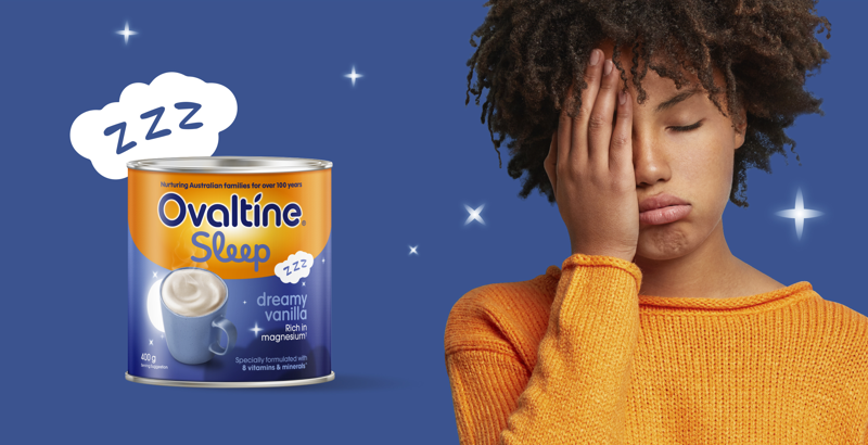
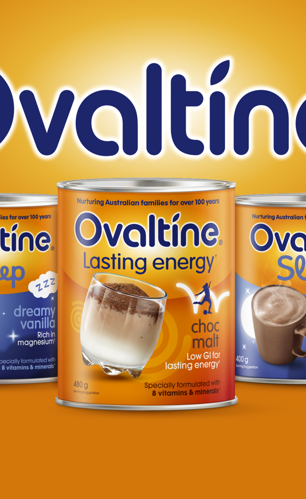
Tasked with a dual mission - B! Brand reinvigorated Ovaltine’s signature Lasting Energy and Light Break core variants and launched a new sub-range at the other end of the energy spectrum - Ovaltine Sleep. Tapped into the timeless ritual of a warm drink before bed, Ovaltine Sleep introduced a new way to wind down with the family in preparation for a good night's slumber.
Solution
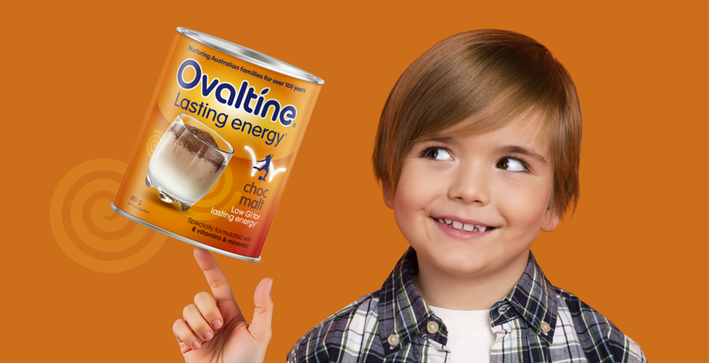
B! Brand retained and strengthened the distinctive brand asset of Ovaltine Orange. The masterbrand was refreshed for modernity with softened letterforms and a curvature that brings a smile in mind, informing the packaging architecture and clear ranging. Across core, we depicted a sustained and less frenetic representation of energy, while the new Sleep range dials into a soothing, serene essence unique to the proposition.
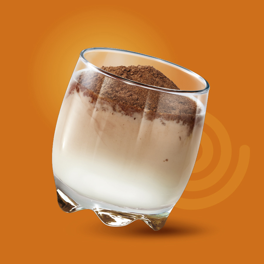
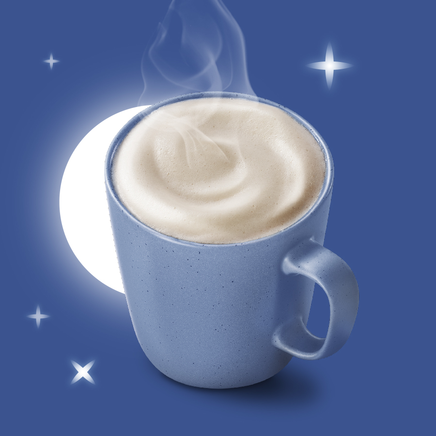
Using our brand building blocks, we enhanced shelf presence with a clear new design
that enabled portfolio expansion:
B Clear
We retained and strengthened the distinctive brand asset of Ovaltine Orange for recognition, clarity and maximum brand impact at shelf.
B Relevant
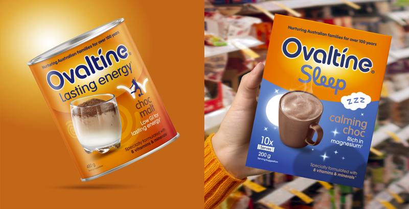
We refreshed the masterbrand identity for modernity and resonance, which informed the packaging architecture for a cohesive range and created opportunity for portfolio expansion.
B Consistent
We created a new sub-range that visually aligns to and strengthens the core range, while bringing to life a unique range proposition for shelf differentiation.


