Grainshaker

Grainshaker
Vodka with Character.
Grainshaker set out to disrupt the vodka category with a modern Australian take on craft spirits rooted in locally sourced grains and a straight-talking, grounded personality.
Challenge
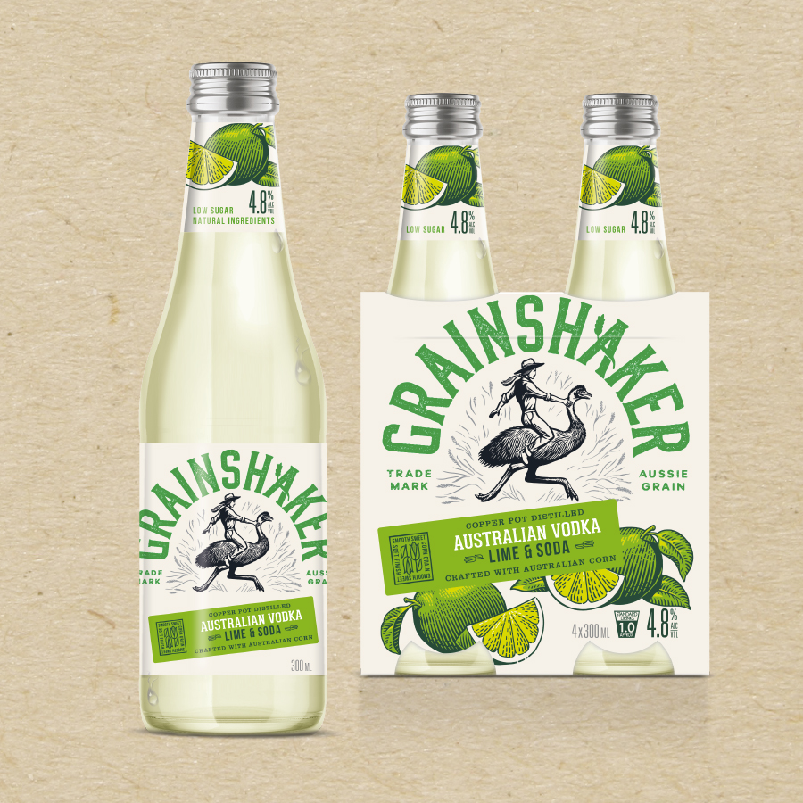
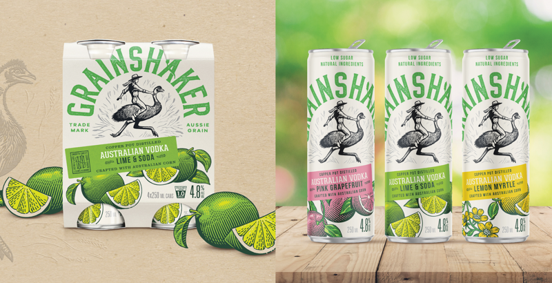
In a cluttered RTD market dominated by global players, the challenge was to create packaging that captured Grainshaker’s distinctive story; bold, fresh and uniquely Australian while ensuring strong shelf presence and easy navigation across multiple flavour profiles.
Solution
B! Brand created a bold, contemporary packaging system for Grainshaker RTDs, celebrating its craft credentials and Australian roots. Clear hierarchy, confident typography and flavour-led colour cues ensure standout appeal, while the design flexes seamlessly
across the growing portfolio.

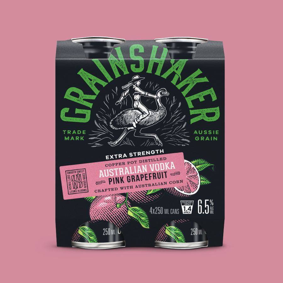
Using our brand building blocks we created a design system that was clear, relevant and consistent:
B Clear
Simplified pack architecture, with bold branding and intuitive flavour navigation for easy consumer recognition and purchase confidence.
B Relevant
Embraced an authentic, straight-up tone with modern, vibrant colour palettes and typography to connect with a new generation of vodka drinkers.
B Consistent
Leveraged Grainshaker’s distinctive craft cues and brand personality, building a flexible, scalable design system for future innovation.
