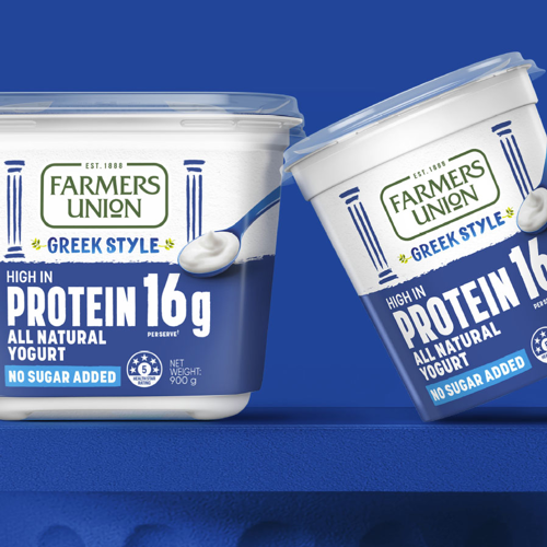
FUGY Gut Good
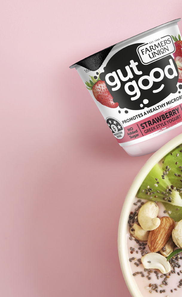
Farmers Union Gut Good
Gut Health Meets Great Taste.
Farmers Union identified gut health as the next major growth frontier in the yogurt category, but no brand had yet claimed ownership of it.
Challenge
To seize the opportunity, Gut Good by Farmers Union needed packaging that clearly communicated its health benefits while appealing to a younger, proactive audience. The challenge was to elevate taste appeal, simplify navigation through strong colour coding, and unify the new sub-brand under the trusted Farmers Union masterbrand balancing scientific credibility with flavour, freshness and approachability.
Solution
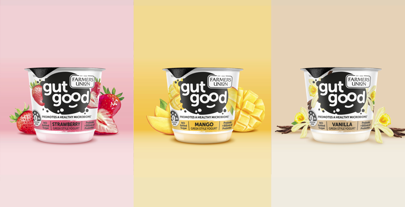
B! Brand refined Gut Good’s packaging to clearly communicate its gut health credentials while maximising taste appeal and shelf standout. We created a clean, modern system balancing bright, flavour-led colour palettes with strong health cues bringing energy, clarity and cohesion to Farmers Union’s newest innovation while strengthening its link to the masterbrand.

Using our brand building blocks we brought the Gut Good identity to life making gut health more appetising, accessible and aspirational.
B Clear
We created an intuitive hierarchy and clear flavour navigation, ensuring key benefits were immediately visible.
B Relevant
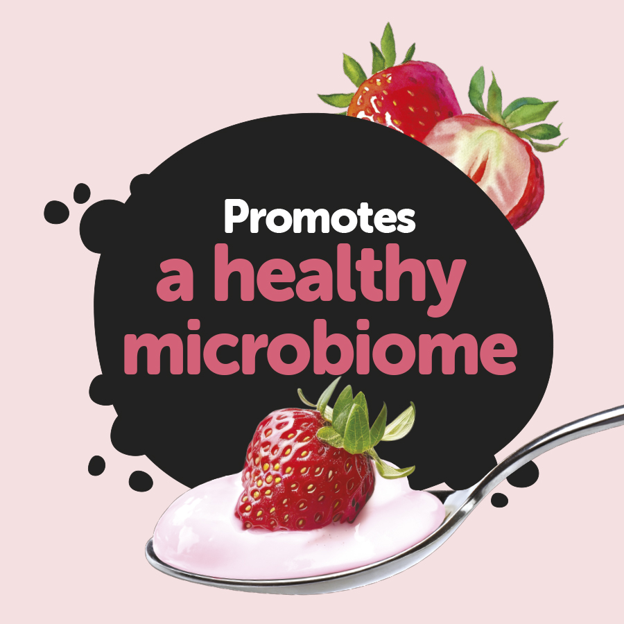
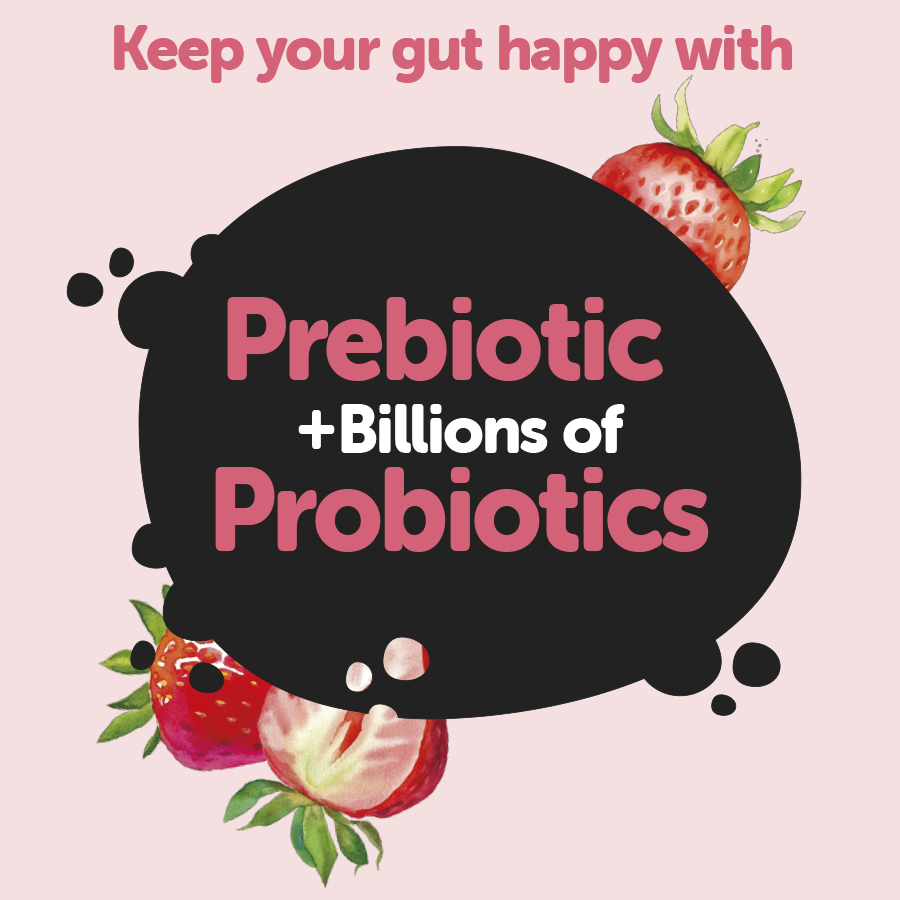
We shifted focus to taste-led imagery and language that connects with younger, health-conscious consumers.
B Consistent
We retained key Farmers Union distinctive brand assets while evolving the design for a modern, premium feel that can scale across future formats.
