Cadbury Twirl (OOH)
Cadbury Twirl
More! Swirls & curls.
Cadbury set out to re-energise the Twirl brand and engage a younger Gen Z audience
with the introduction of a super-sized 43g single bar.
Challenge
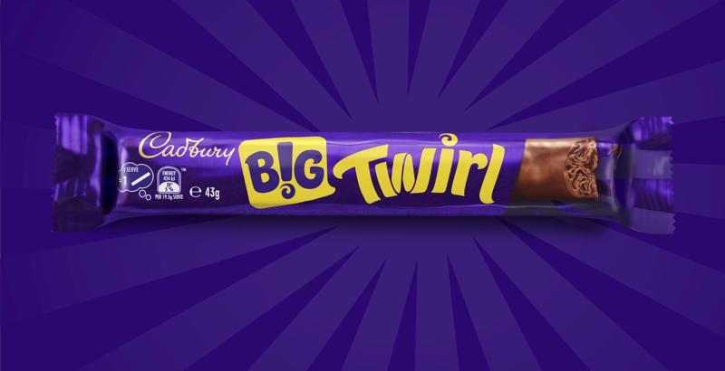
The main objectives were to create excitement around the new format, reinforce Twirl’s core brand identity and communicate a more indulgent, treat-worthy experience. B! Brand was tasked with differentiating the “Big Twirl” bar from the iconic twin bar by leveraging core brand assets and highlighting its chocolate swirls, aiming to boost relevance for younger consumers, shelf impact and instant brand recognition.
Solution B!
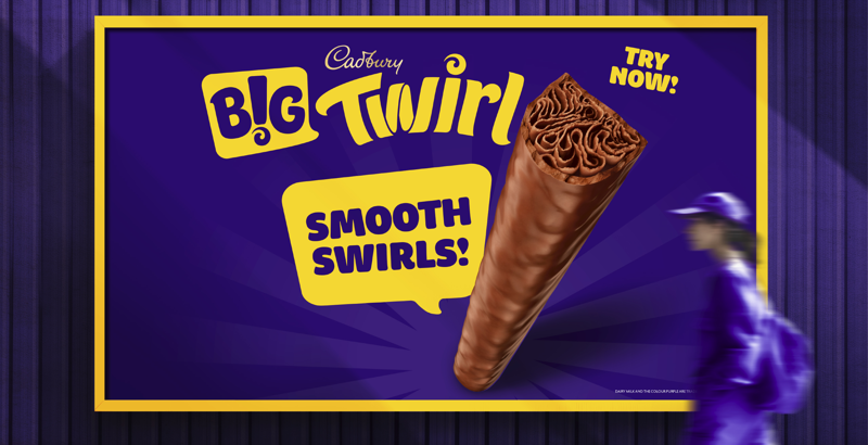
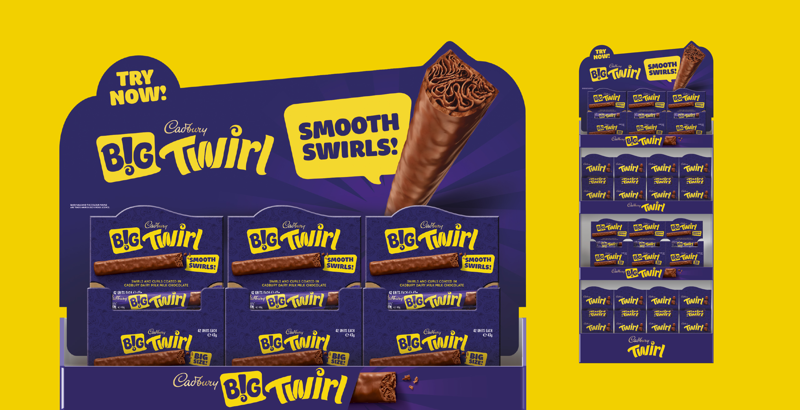
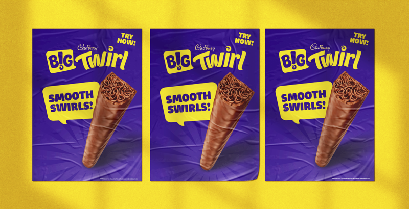
B! Brand leveraged the bold Twirl logo, dynamic chocolate swirls and Cadbury’s iconic purple to highlight the super-sized offering. The “BIG TWIRL” name amplified heritage. Larger-than-life Twirl imagery emphasised indulgence, while a disruptive speech bubble graphic device made the launch unmissable.
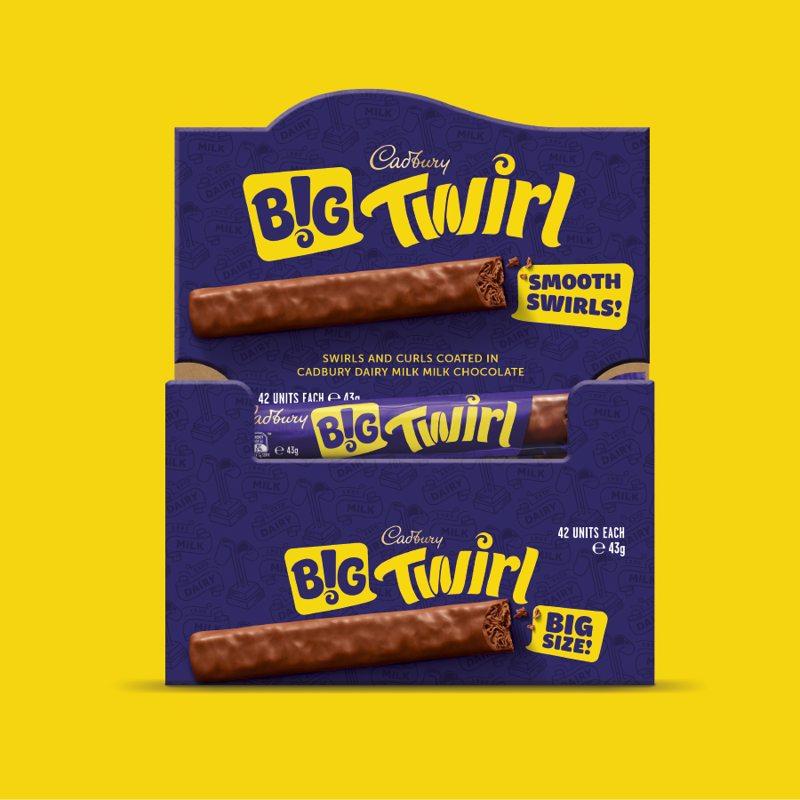
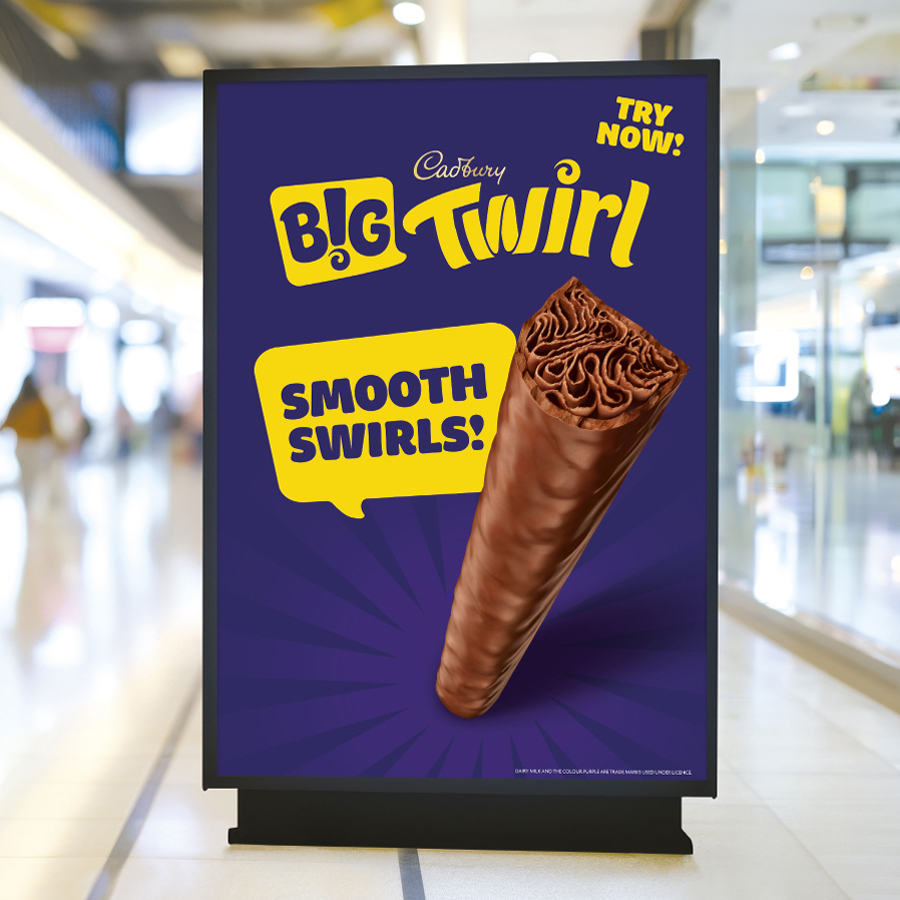
Using our brand building blocks ensured distinctive assets delivered shelf standout and excitement for a new generation:
B Clear
We highlighted the bar’s super-sized nature by enhancing the “Big Twirl” identity and using bold, upright visuals for instant shelf recognition.
B Relevant
We created an energetic design and bold messaging to engage Gen Z and younger audiences, enhancing the bar’s larger,
B Consistent
We retain Twirl's distinctive core assets to ensure brand continuity and clear recognition while differentiating the new 43g bar from the existing core range.
