Y is for Yoplait.
Challenge: As Australia’s favourite yogurt brand, Yoplait has an enviable extensive range at store level. With the yogurt category continuing to attract new challengers and boutique brands, it was key to cement Yoplait’s market – leading position by strengthening brand impact and product proposition.
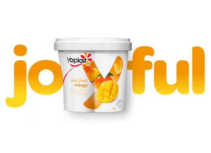
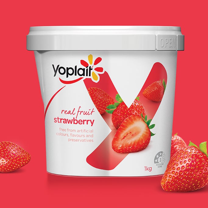
Solution: B! Brand evolved the packaging to better reflect Yoplait’s delicious combination of real fruit and pure dairy goodness, all while promoting the powerful ‘Y’ mnemonic as a key distinctive asset for consumer recognition.
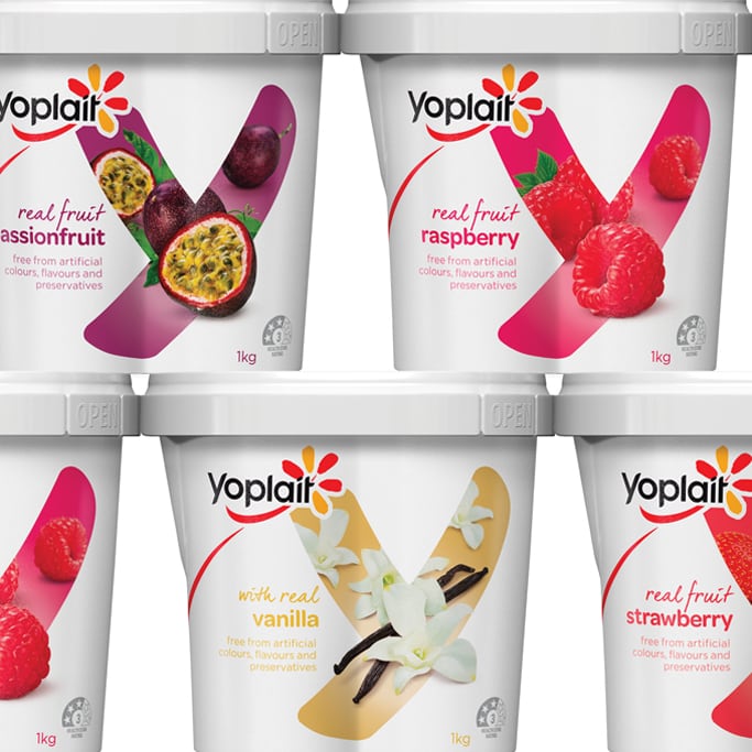
A move to an opaque white tub immediately enhanced shelf impact. From there, we refined the overall pack design with simplicity in mind, bringing freshness and modernity. A new imagery strategy highlighted real fruit credentials and naturalness.
Now, shoppers can’t miss the ‘wall of Y’ and be reminded of the taste of the yogurt they’ve always loved.

Little snacks for little folk.
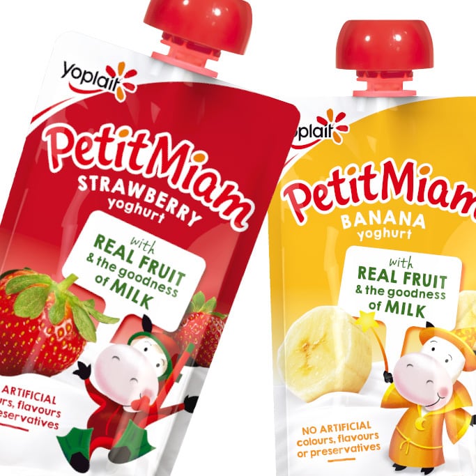
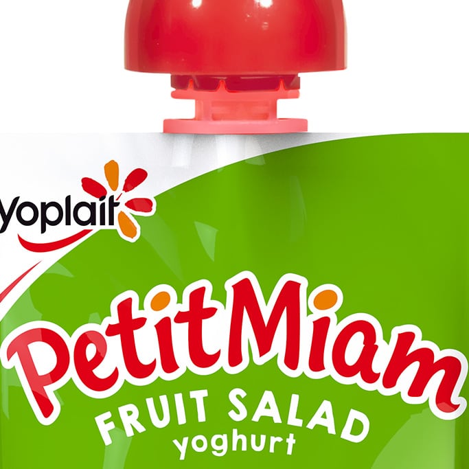
Challenge: Petit Miam is a household name, but traditionally anchored in the baby market. The brand and packaging needed to stretch and engage a broader target of children. We also needed to find a balance between highlighting the health credentials for mums and being fun for kids.
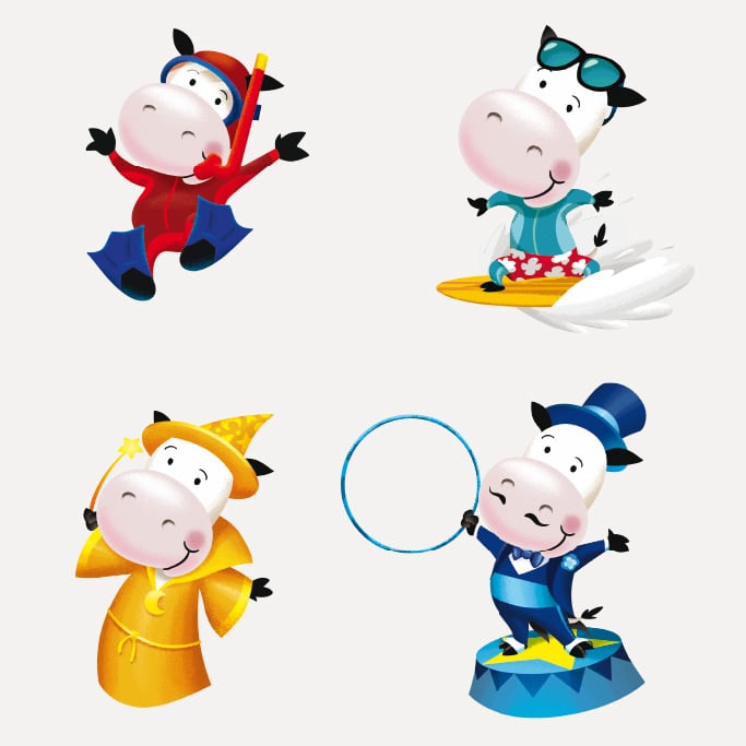
Solution: Consumers associate Petit Miam with its cow so keeping the cow on pack was a must! However, it was the innocence of the Petit Miam cow that anchored the brand in a younger space. To combat this, we gave the cow a purpose: she became a different character on each pack – a pirate, a snorkler etc. – to excite and engage older children. While the packs are fun and energetic they also look natural to reassure Mum, with key messaging brought to the fore.
Petit Miam now resonates with a broader age range and its health credentials ensure it is snack of choice for the little people.
