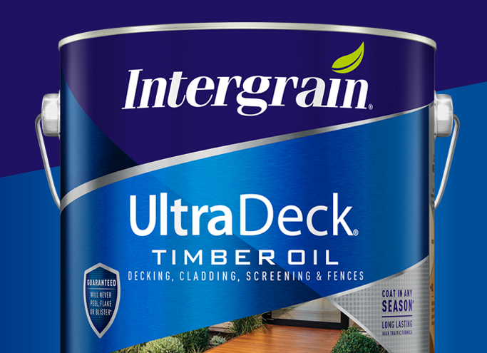
Ultra slick repositioning.
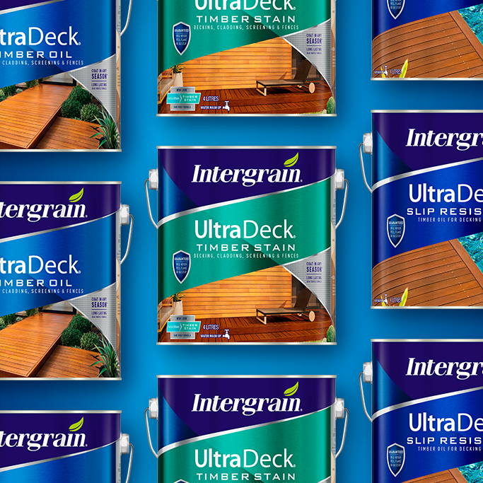
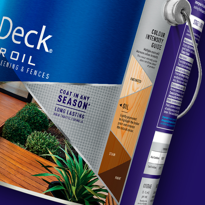
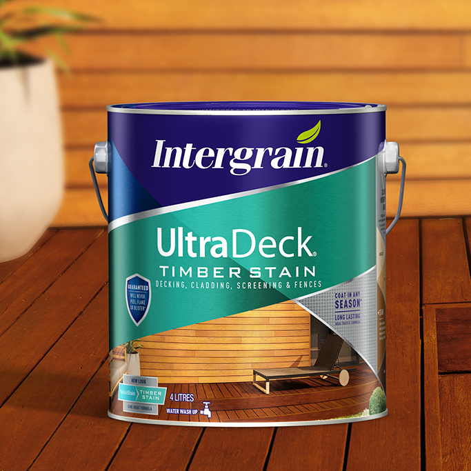
Challenge: Intergrain is a high performance range of advanced timber finishes. However the packaging didn’t represent the premium price point and made it difficult for consumers to shop the range and understand the end result of each product. To address this B! Brand was briefed on restructuring the range architecture, making UltraDeck a sub-brand, and refreshing the packaging.
Solution: B! Brand evolved the Intergrain masthead to a dynamic angled shape to talk to the high performance positioning. Utilising the print process, allowing the metallic tinplate to show through, we created a dual colour variant panel and silver bands creating a strong, impactful can that stands out on shelf.
A professional finish.
Challenge: Feast Watson has an immense heritage and quality credentials amongst discerning wood care aficionados, trade professionals and DIY enthusiasts. But to grow the range and attract a new, younger audience required a re-imagining of the Feast Watson identity and range.
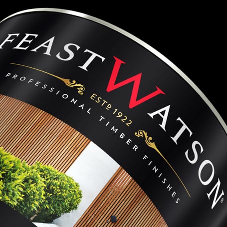
Solution: B! Brand cemented Feast Watson as a modern heritage brand, building on the trust that has been built on since 1922, yet expressing in a contemporary manner. Simple, stylish design elements define the brand: an iconic red ‘W’ positioned proud and central within the white Feast Watson wordmark sits on a rich black background colour.
The wordmark has been specially crafted to create a unique typestyle that brings heritage cues to life with modern relevance for today’s consumers. With this masterbrand standing confidently on all packaging with metallic gold highlights adding premium and quality cues. Packaging is supported with a bold photographic style, using lifestyle or functional imagery to engage consumers and depict usage and product attributes. The Feast Watson brand and packaging perfectly combine modern and heritage cues, building on the inherent trust of the brand.

A refreshing new look.
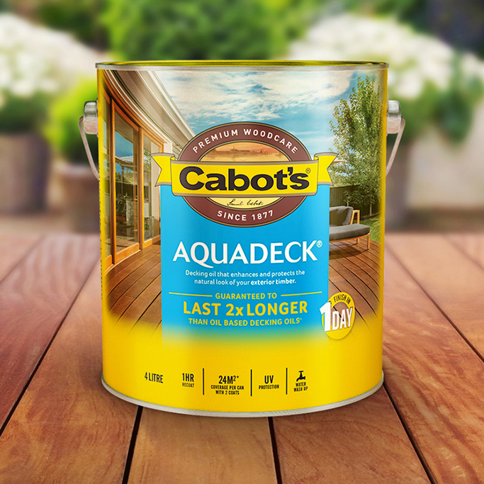
Challenge: Cabot’s is the clear market leader in wood care in Australia, however its positioning and identity has evolved organically over time. Combined with an increase in premium brands, and some respectable value brands nipping at its heels, Cabot’s market position had been squeezed. In order to retain its enviable market leadership and set up for future growth Cabot’s re-articulated its brand and packaging.
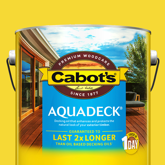
Solution: Working with a heritage brand B! Brand retained the Cabot’s identity but centralised the distinctive yellow brand block and wrapped up all key hierarchy and messaging into this space. This block now stops consumers in their tracks – in-store. Bold aspirational photography showcases, not only the deck but also, the whole backyard bringing to life the deck as ‘third living space’. A contemporary typeface coupled with consumer driven language and messaging translates to a simple, stylish modern design re-positioning Cabot’s as a trusted, contemporary, premium brand. The Cabot’s packaging refresh is a perfect mix of the trust and heritage, and premium contemporary lifestyle reflecting
the Australian backyard.
