Pure provenance.
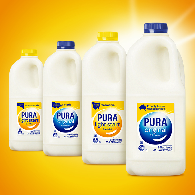
Challenge: For those of us in Australia’s southern states, PURA milk needs no introduction. The brand has been a part of Victorian, Tasmanian and South Australian heritage since 1935.
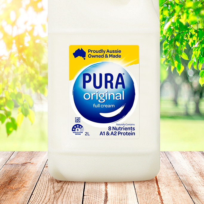
Our task was to remind consumers of PURA’s local production and Aussie ownership in a fresh and modern way. This meant a refresh of its packaging, which had become outdated and cluttered over time. Our brief was all about modernity, and bringing the positioning of positivity and purity to life – all while protecting the brand’s distinctiveness and high recognition on shelf.
Solution: We wanted to create a bold branding device and clear variant selection at store level. So, we elevated the dominant central PURA brand shape, housing the brandmark with pride whilst creating a relationship across the various variants. This included a clear architecture for housing local state-based messages, as well as a consistent spot for health messages.
With the power of colour, we re-energised the packaging so it felt clear and pure. The yellow shining through talks to the bright sunshine and the promise of the day starting right. With positivity and clarity in full focus, we’ve positioned PURA for a bright future.
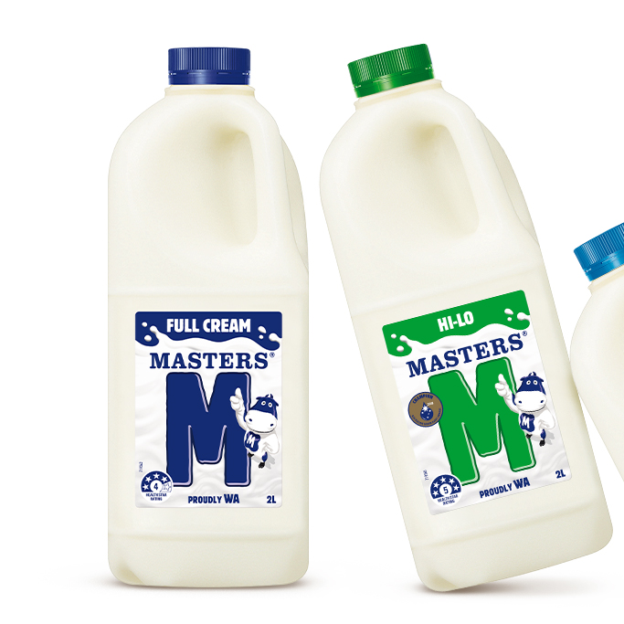
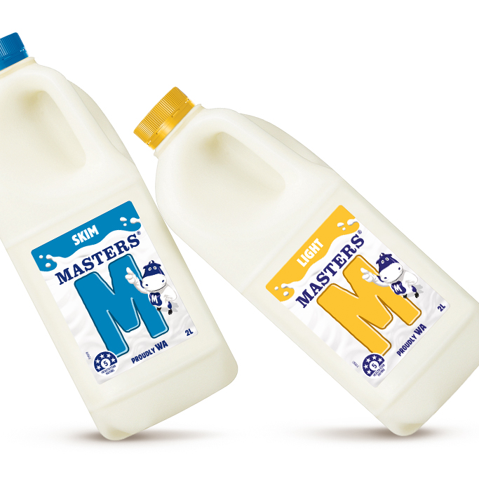
Masters of the future.
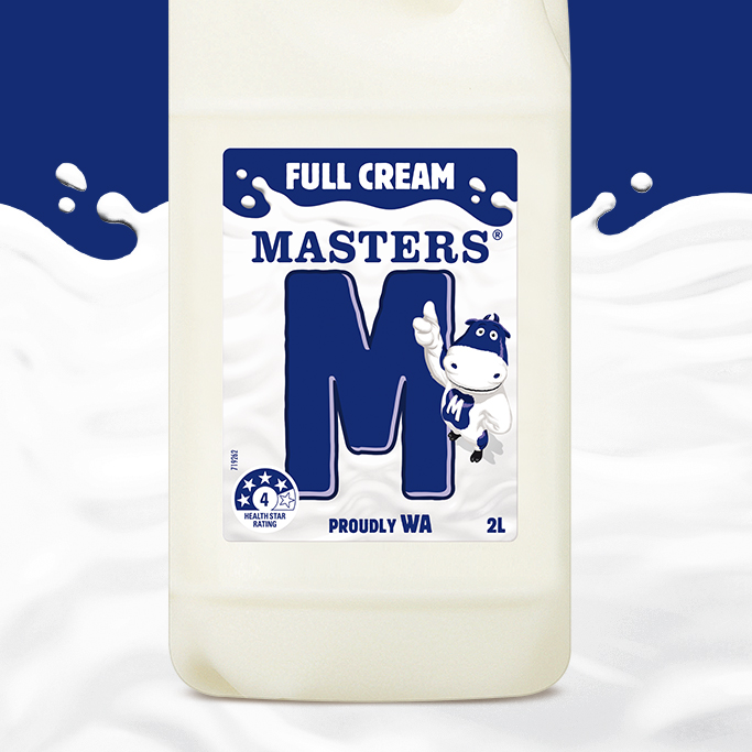
Challenge: Since 1956 Masters Milk has been very much loved and revered by Western Australians. Its much loved flavoured milk range is iconic in the West but had no presence in the white milk category. A category where provenance matters, the opportunity to transfer the equity halo to a white milk offer emerged.
Solution: Leveraging the distinctive brand asset of the ‘M’, the key asset that anchors the brand, was imperative to get attention in store and at the same time clearly differentiate the variants through colour. A new cow character was developed specifically for White Milk, injecting personality onto pack along with the ‘M’ on a river of milky goodness.
A local entrant was created and with effective use of the brand assets – ensures this icon is around for another seventy years.
