Hardware Category
Hardware
We help hardware brands cut through the clutter building trust, impact and standout appeal in every aisle.
From paints and decking oils to power tools and cleaning systems, we know what it takes for hardware brands to connect with shoppers and drive results. It’s about clarity, confidence and making the complex feel simple. We blend practical know-how with creative craft to design brands and packaging that feel authentic, look great and perform in the hands of real users. Whether it’s refreshing an iconic favourite or launching something new, we help brands earn their place on shelf and in every project that follows.


Featured Project
Dulux Brand Strategy
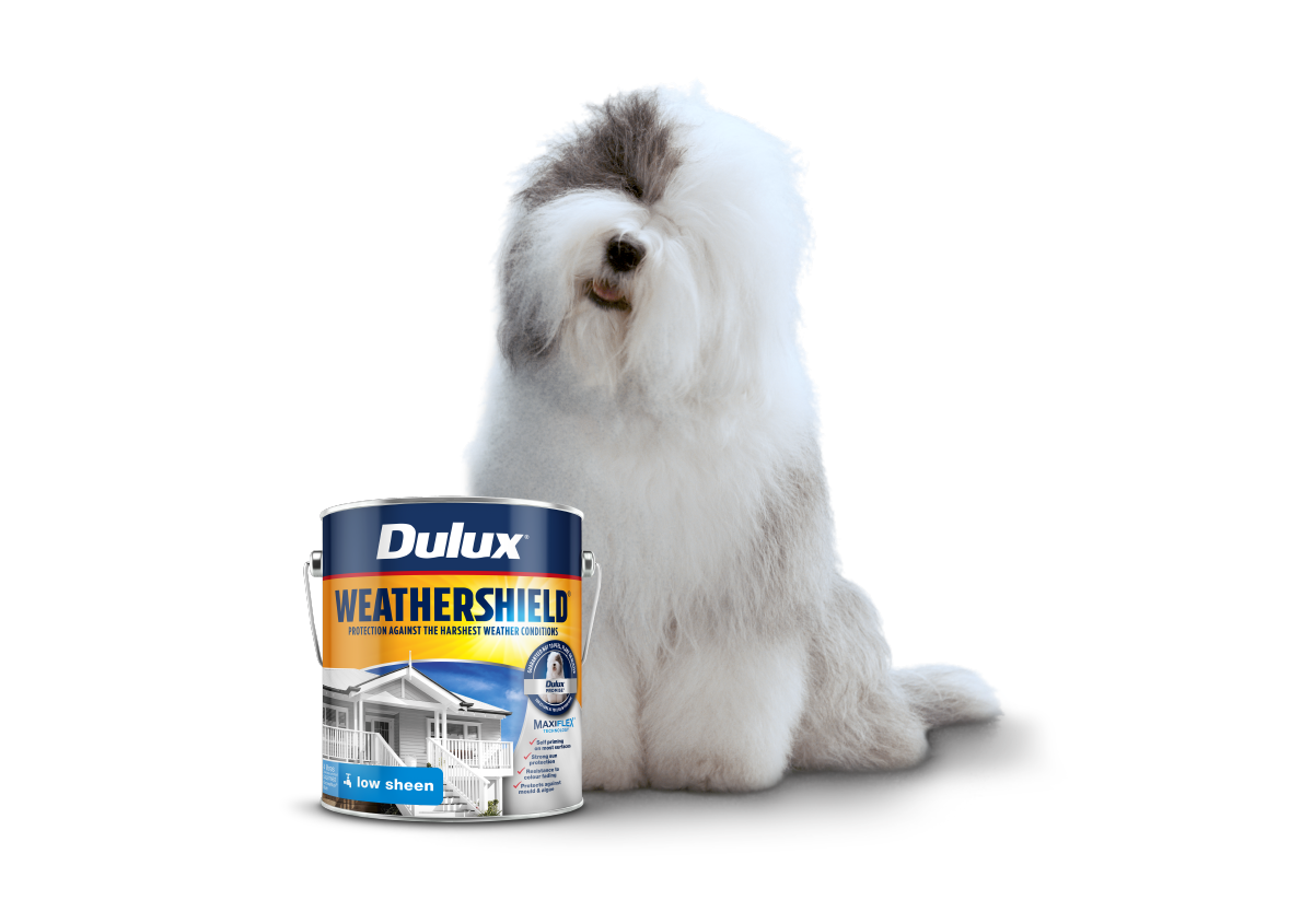
We protect and grow Dulux’s distinctive brand assets ensuring they remain instantly recognisable while continually evolving to meet changing consumer needs, product innovation and category trends. Every project is an opportunity to further reinforce trust, drive innovation and strengthen Dulux’s market leadership balancing legacy and equity with new product development and trends across a vast and diverse portfolio covering both retail and trade markets.
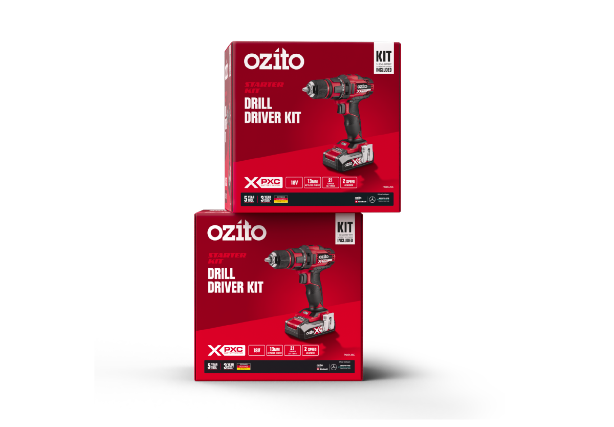
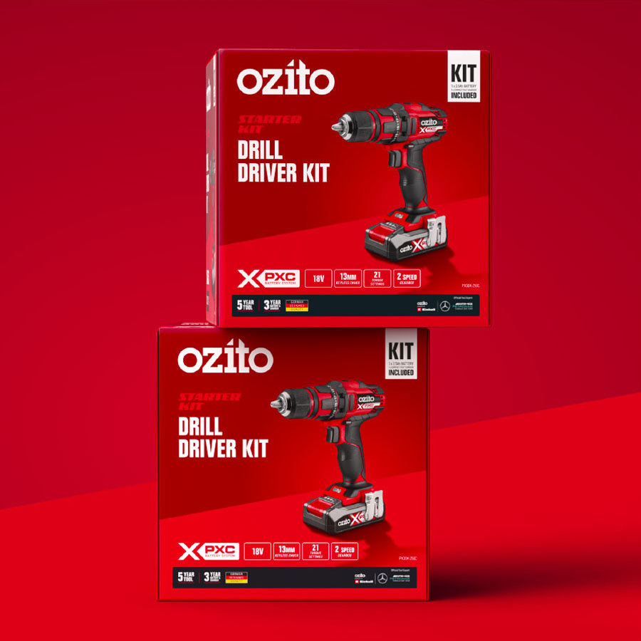
Ozito
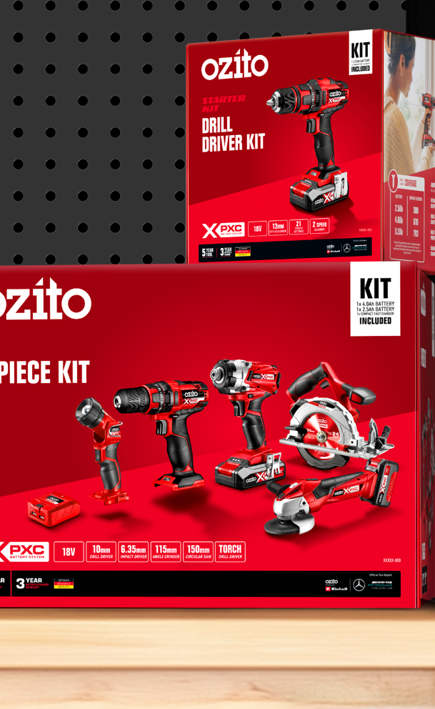
Ozito set out to make its growing range of products easier to navigate for shoppers and in-store teams. B! Brand was brought in to simplify on-pack messaging, strengthen brand presence and create a flexible packaging system that supports both current needs and future growth.
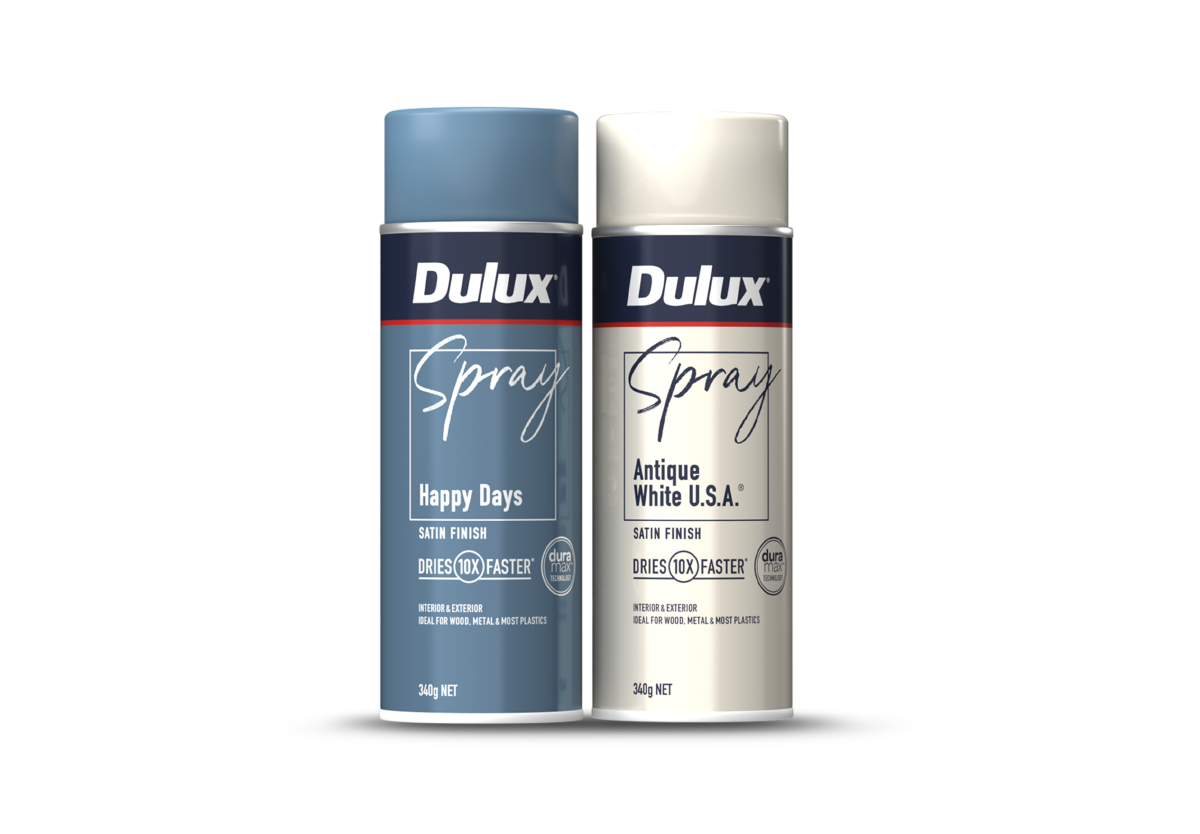
Dulux Sprays
Dulux set out to shake up the aerosol category and make spray paint more approachable for DIYers. B! Brand was brought in to simplify the experience, cut through shelf clutter and create a more accessible, colour-led solution reinforcing Dulux’s leadership while inviting confidence from first-time and seasoned users alike.
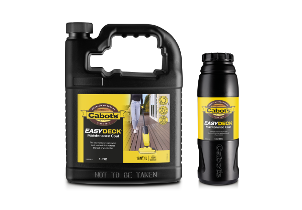
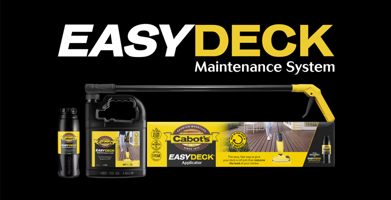
Cabot's Easy Deck
Cabot’s set out to make deck maintenance easier and more accessible for homeowners. B! Brand was engaged to create a design system that highlighted this innovative, hassle-free solution clarifying benefits, simplifying use and differentiating it from traditional oils while reinforcing Cabot’s leadership in the decking category.
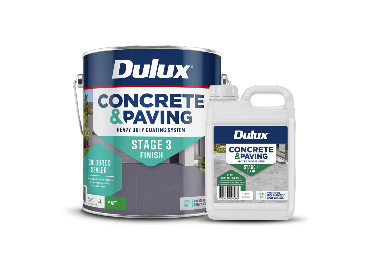
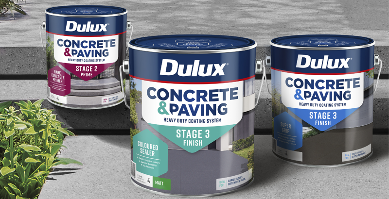
Dulux Concrete & Paving
With homeowners seeking to refresh their outdoor spaces, Dulux saw an opportunity to extend beyond traditional paint into exterior transformations. B! Brand was tasked to develop the Concrete & Paving sub-brand and packaging from the ground up, creating an inspiring, approachable solution that complements Dulux’s exterior portfolio while standing out with a distinctive, confident identity.
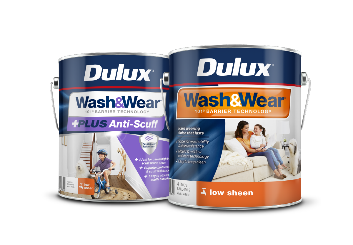
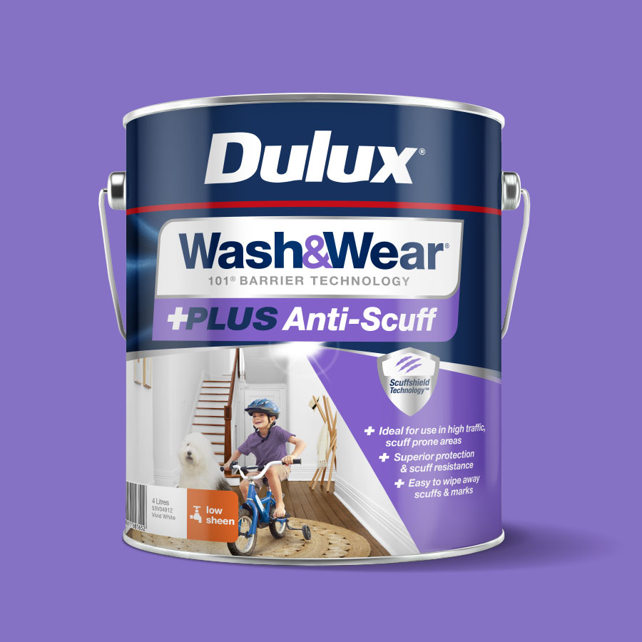
Dulux Wash & Wear
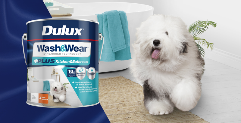
As a category leader, Dulux Wash&Wear sought to stay ahead amid rising competition and bold “all-in-one” claims. B! Brand was engaged to refresh Wash&Wear Core, +PLUS and Pre-Tint packaging, modernising the look, simplifying navigation and reinforcing the premium value ensuring Dulux retained its trusted, leading position in the washable paint market.
