Waking a sleeping giant.
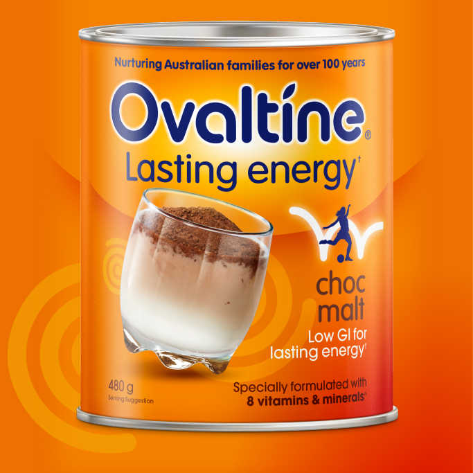
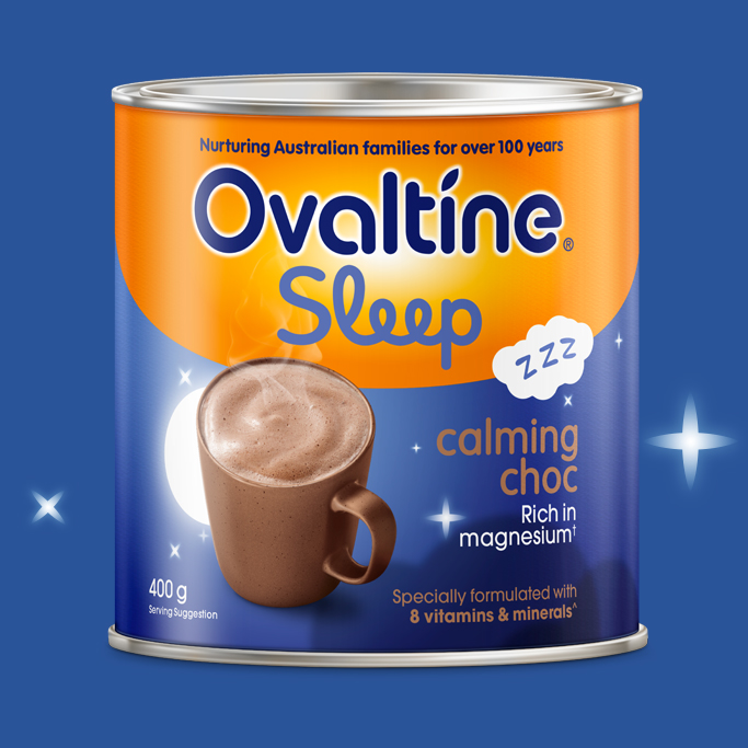
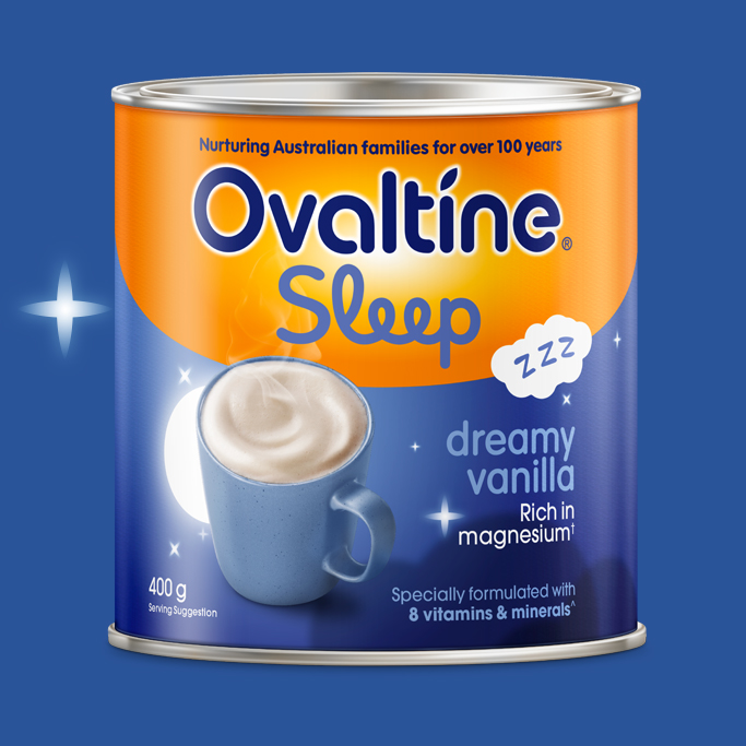
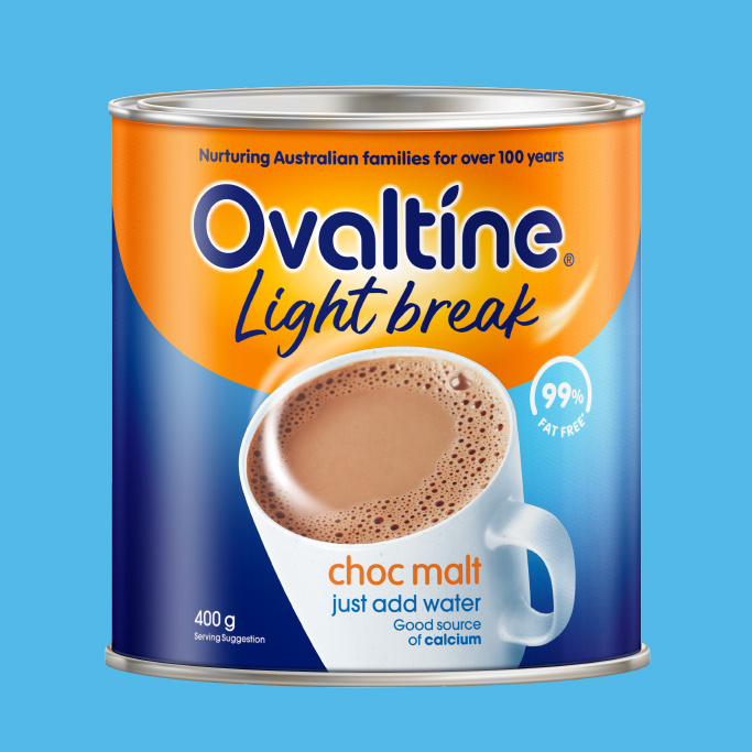
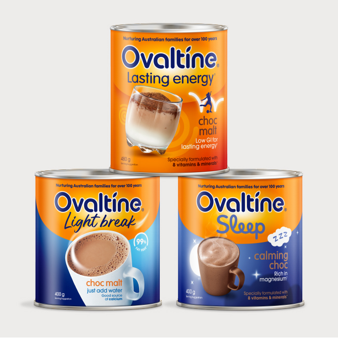
Challenge: Within the realm of the kids’ pre and post sports drink arena, Ovaltine has historically stayed in the shadows of the mighty Milo brand. But just like the classic tale of David and Goliath, Ovaltine was poised for an impressive comeback. The brand needed to be awakened within memory structures and refresh its legacy, by catering to a crucial need in Australian households. B! Brand played a pivotal role in Ovaltine’s dual mission: to reinvigorate its core signature ‘Lasting Energy’ and ‘Light Break’, while introducing an NPD on the other side of the energy spectrum, ‘Ovaltine Sleep’. This new sleep proposition tapped into the age-old ritual of enjoying a soothing milk drink in preparation for a good night’s slumber. Energised days begin with restful nights.
Solution: Retaining and strengthening the brand asset of Ovaltine Orange was vital to evolving the brand identity. The Masterbrand logo was refreshed with a softened and rounded letterform and straightened in its position on pack. The brand positioning statement ‘Nurturing Australian Families for over 100 years’ was proudly featured above the Masterbrand. For the traditional ‘Lasting Energy’ and ‘Light Break’ variant, the new approach depicted a more sustained and less frenetic representation of kids’ energy. The new ‘Sleep’ variants shared the Masterbrand identity, with the direction developed towards a soothing, serene essence. With the sky-high success of the new Sleep NPD variants and approximately 5% uplift of the existing ranges, based only on pack design changes, the ‘slaying of the giant’ has truly begun.
