Brand Refresh-ing.
Challenge: Australian-made and owned since 1932, Cedel has enjoyed long-term success as a heritage brand in the oral care category. Whilst they held credibility, the brand lacked a strong and consistent identity across the range. What Cedel needed was a refresh of its core brand equities to enable growth into the future – for its existing products, and new ones too.
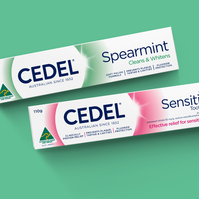
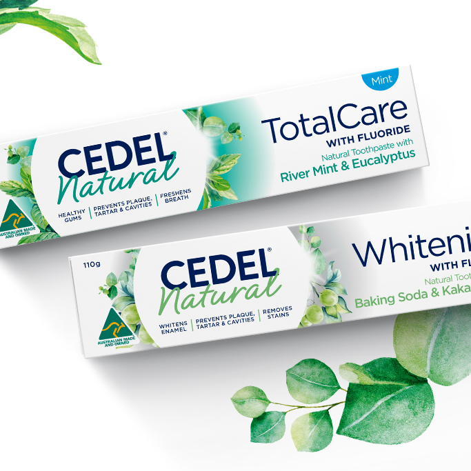
We worked alongside Cedel to refresh their Core range and launch their new ‘Naturals’ toothpaste. This meant our design needed to work together as a cohesive portfolio of old and new, yet differentiate the individual range propositions. It also needed to cater to the different needs of both current (loyalist) and new (modernist) consumers.
Solution: We created a brand identity and packaging design that puts the Cedel masterbrand front and centre. This radiates efficacy and connects with loyalist consumers of the Core range. With a sub-range lock-up, we created a platform to expand this credible heritage brand into the new Natural space.
Modern imagery was an important addition, bringing to life the native Australian botanical ingredients. So too was locking up the unique benefit of added fluoride with the overarching functional benefit of TotalCare or Whitening, as shopped by the consumer.
Now wherever you see Cedel, the future looks bright!
