Refreshment, with sparkle!
Challenge: Mildura is a fun and nostalgic brand for many Australians, with the highest brand loyalty in the category. It traditionally trades on value, and has attracted a similar audience for years. So how does an old-fashioned brand transition into a new sparkling format and recruit modern consumers looking for a healthier refreshment?
Solution: We promoted the most distinctive assets of the Mildura brand to protect its legacy and transition brand loyalists across. And to attract a new generation of drinkers, we deliberately built on the brand’s taste and refreshment cues to talk to the new proposition of Sparkling Juice. The splash of fruit and water is key to the brand refreshment, along with sparkling bubbles that inject further energy and excitement.
Alongside a successful refresh of Mildura’s Core Juice offer, what’s old is new again!
A daily dose of good.
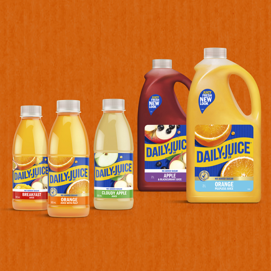
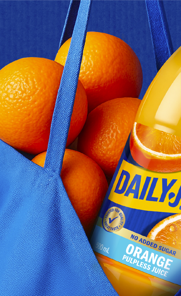
Challenge: To overcome sugar and health concerns across juice lovers, and to encourage consumers to trade up, the Daily Juice functional range was created. A new 1L range of juice blends combined the goodness of fruit with added vitamins, minerals and fibre, giving consumers the opportunity to boost their morning breakfast routine with a health kick. Next was ensuring the health benefits were clearly communicated through the packaging.
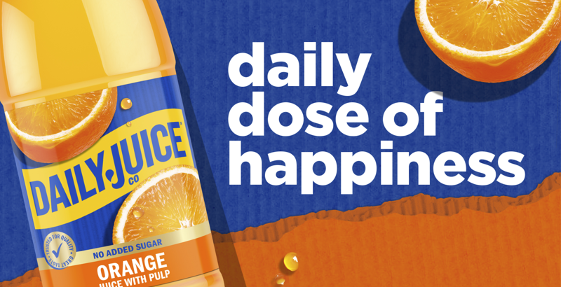
Solution: We leveraged Daily Juice’s strong brand awareness and consumer loyalty to create a recognisable but distinct package design. The new packaging celebrated the hero fruits that are centric to the brand, while emphasising its differentiation through clearly communicating its added functional ingredients and benefits.
Our favourite juice with benefits!
Full of character.
Challenge: A consumer shift away from sugary drinks to healthy alternatives created an opportunity for Prima to develop a flavoured water range.
To attract new consumers and differentiate from competitors, the range needed to be fun and engaging to appeal to young children, whilst also reassuring parents of the health benefits.
Solution: With kids and their imaginations top of mind, we created a vibrant underwater world for Prima, filled with engaging characters from the sea.
Each with its own kooky characteristics, we created our fictional ‘Creatures of the Deep’ – complete with big, googly eyes and a simple, bright colour to reflect the water’s flavour. Set on a light blue background, we enhanced a world under the sea and created excellent shelf standout.
For parents, the familiar Masterbrand sits proudly at the top of the packaging, supported by handdrawn fonts and messages to communicate health benefits and key claims.
Now Prima’s diving headfirst into our kids’ hearts and imaginations.
Naughty by Nature
Challenge: The kids juice category is littered with Juice Drinks in tetra blocks and multipacks to fill the lunchbox, snacking or after school occasions. Berri is the only player with real Fruit Juice in the segment and had an opportunity to re-launch its pop top range to be sold as singles and multi buys. Traditionally targeted at Mums, but clearly a kids product.
Solution: To capture the portion of the kids lunchbox category it was imperative that we talk exclusively to kids. And to do so with humour, fun and memorability so that it is asked for time and time again. The narrative is cheeky, naughty and appealing with exaggerated character features, big eyes and facial expressions that tell a fruity tale.
By creating a character for each of the variants promotes the single pop-top, yet the playful style groups the range together and tells a greater story. And with Berri’s strong master brand logo underpinning the design – strongly reassuring mum that its quality and heritage is in every juice.