Bite size fun.
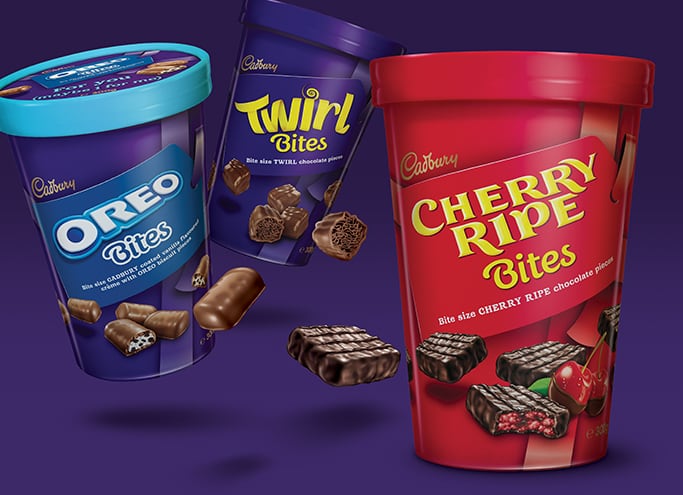
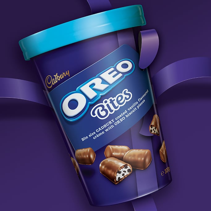
Challenge: Launch a range of scrumptious bite size chocolates that perfectly blend the fun of snacking with the generosity of gifting. Our task was to highlight the fun of the small portions yet maximise the impact of the unique tub format at POP. The design had to flex across personality brand of local gem Cherry Ripe as well the popular Twirl and Oreo and allow for further growth.
Solution: By integrating the branding into a gift tag with ribbon effect, we brought
the occasion front and centre on pack. And we maximised the tub format by wrapping the ribbon device around the pack, and having some fun with the freshness seal inside – creating a series of fun messages that become discoverable as you delve through
the layers.
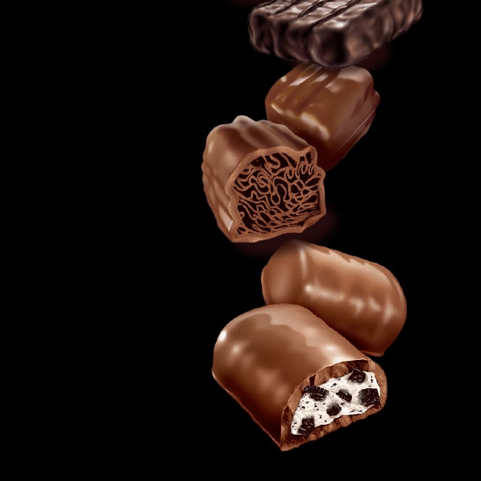
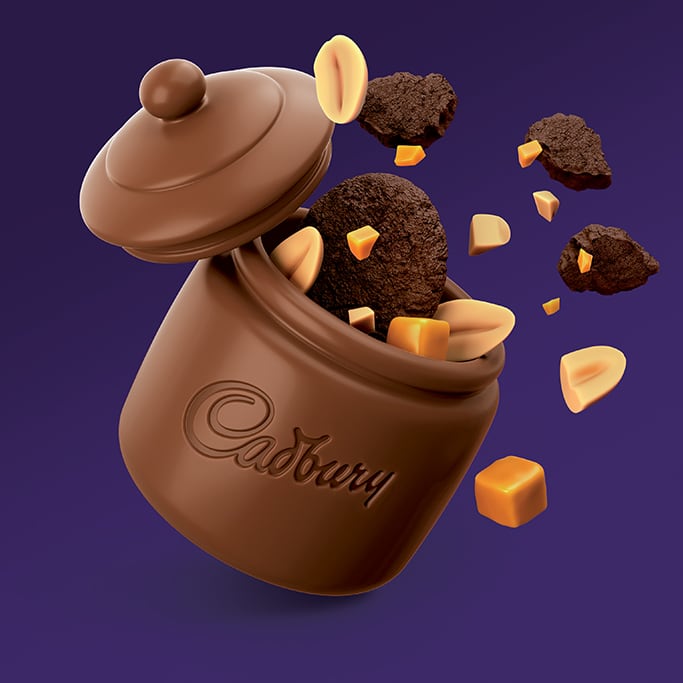
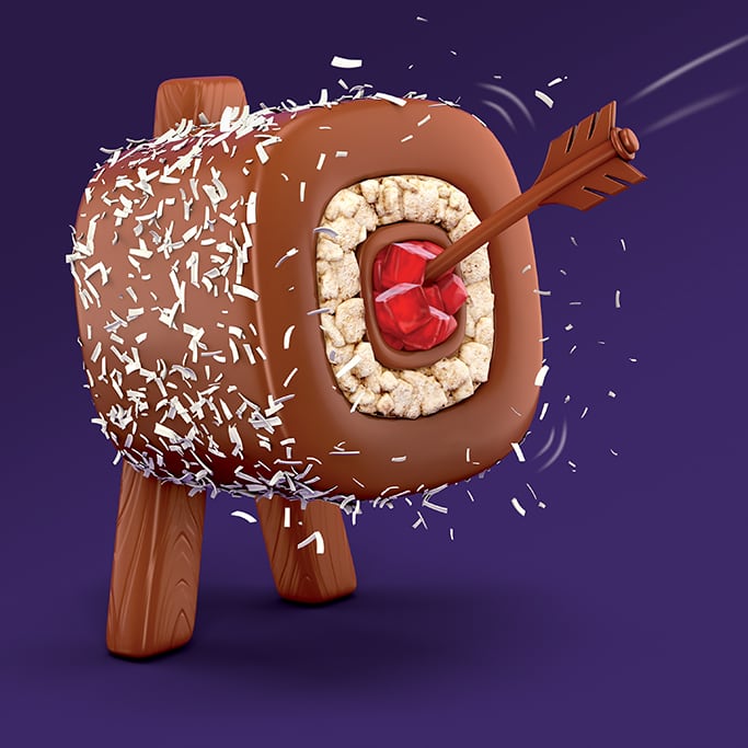
Dynamic product illustrations and angled graphics further underpin the fun and treat cues. And depict that these sweet, irresistible treats can be picked up and devoured in a single mouthful.
The result is a fun, friendly format suitable for many occasions. For yourself, to share or gift!
Sharing is caring.
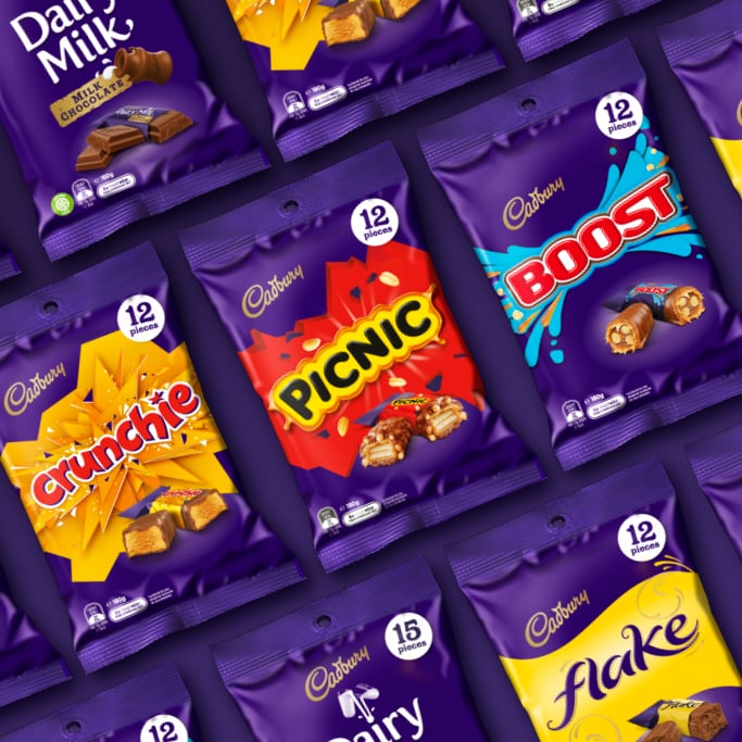
Challenge: Cadbury’s share pack range is large and complex. With multiple formats, sizes and brand configurations. It housed personality brands, CDM and also mixed bags of family favourites.
Our challenge was three-fold: refresh the design by bringing brand blocking and order to the range, aid shop-ability and promote appetite appeal (many packs were without chocolate imagery – missing the opportunity to entice consumers).
Solution: We started with a pragmatic approach: a SKU, asset and mandatory audit. From there, we had a clear picture of the variables our design system needed to account for.
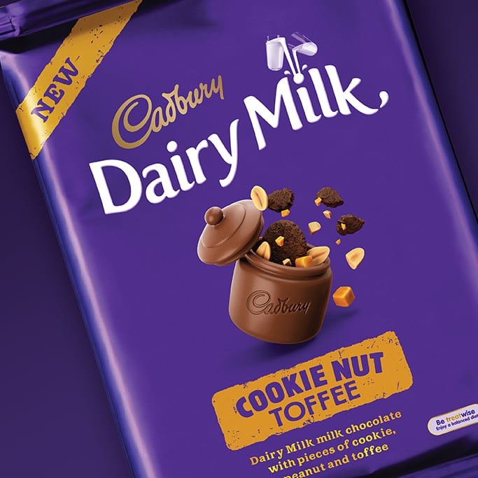
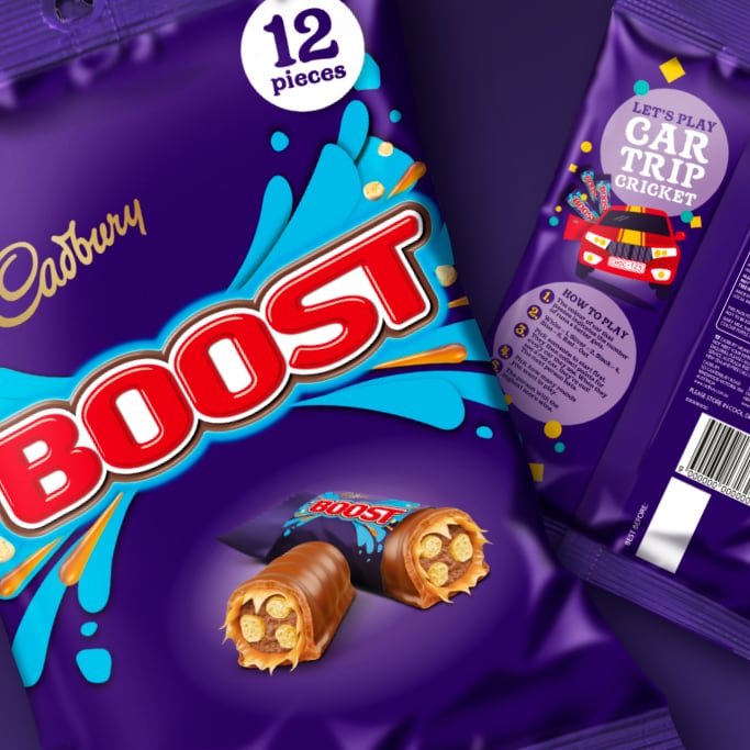
We created a strong consistent architecture which allows for clear communication of the sub-brand and pack quantity, ensuring ease of navigation. And created photo-real illustrations of all the bars – bringing dynamism and appetite appeal to the packaging as well as additional differentiation.
And we really had some fun with the back of packs! Highlighting different sharing occasions – from road trips, to trivia nights and party pinatas – through illustration and quirky copy.
Now what was a disparate collection of packs feels like a holistic range, with something for everyone.
100 years in the making.
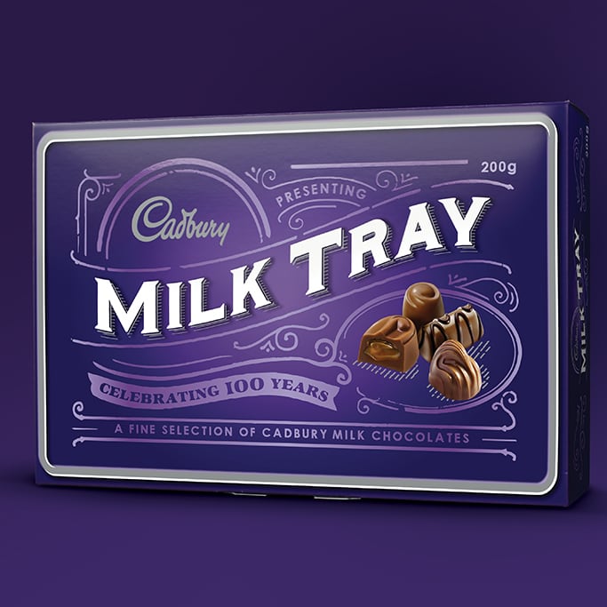
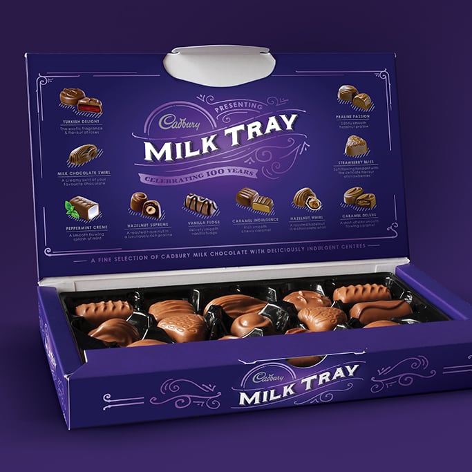
Challenge: Cadbury Milk Tray has been an Aussie icon for 100 years! So to celebrate, and to create ‘new news’ around a brand that is constantly challenged by increasingly premium and contemporary offers, B! Brand revamped this nostalgic fave to remind consumers why these classic choccies have endured the test of time.
Solution: B! Brand have cleverly emulated a pressed metal tin from the early 1900s, to not only appeal to long-time brand loyalists, but to present something a little bit different to attract prospective new purchasers. Silver metallic ink, a spot gloss varnish and faux embossing all add tactility and bring to life the filigree and retro typography of yesteryear that define the nostalgic look of the range.
Rather than re-invent it as something it’s not, this packaging embraces Cadbury Milk Tray’s heritage and presents it as the classic it is.
