FUGY Greek Style Yoghurt

Farmers Union Greek Style Yoghurt
Natural Pillars of Taste.
Farmers Union needed to revitalise its iconic Greek Style Yogurt to stay relevant with consumers and meet growing sustainability expectations.
Challenge
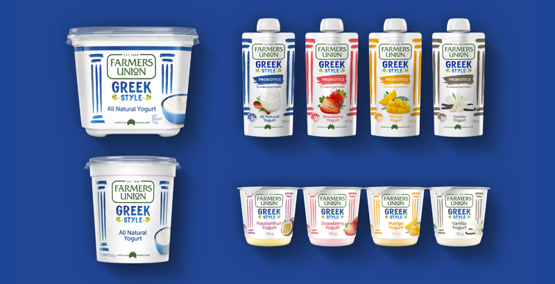
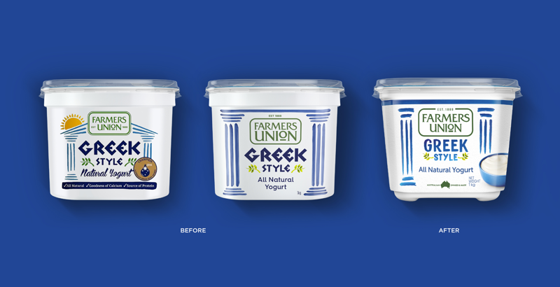
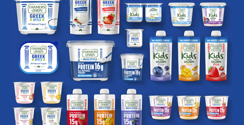
With packaging unchanged for years, the move to a more sustainable format was an opportunity to modernise the brand’s look and create a more engaging identity while carefully preserving heritage and unlocking growth across new ranges and evolving yogurt occasions. B! Brand was tasked with unifying this refreshed, modern identity across the entire Farmers Union portfolio.
Solution
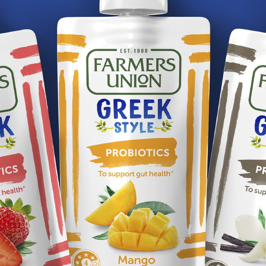
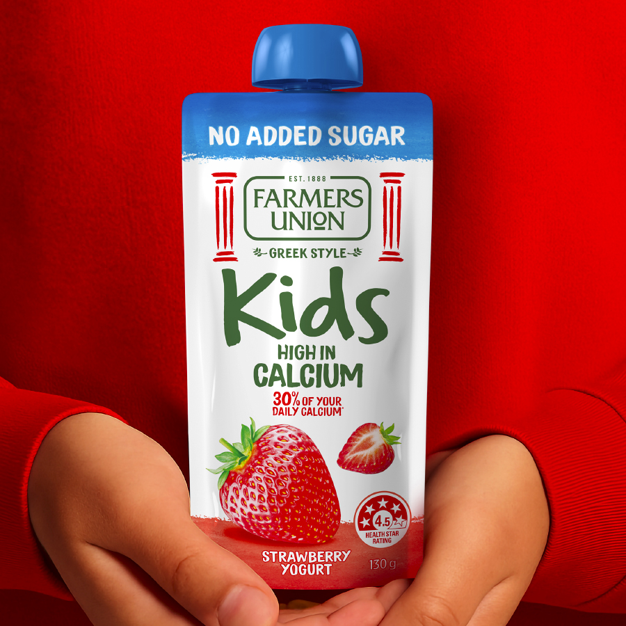
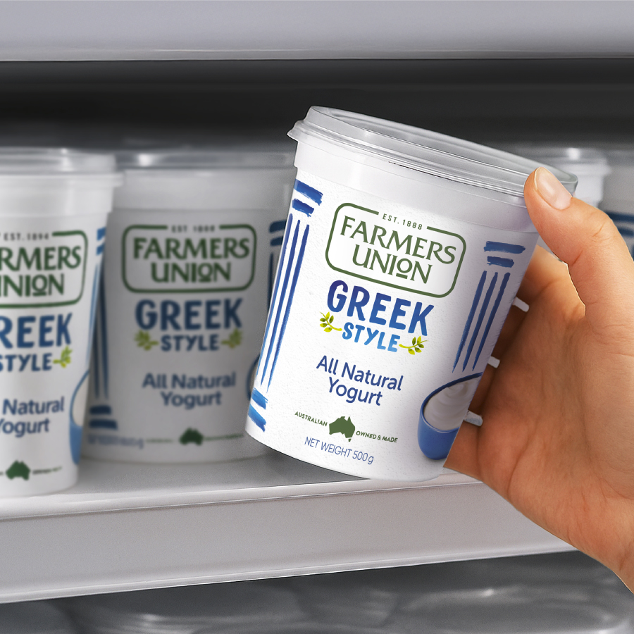
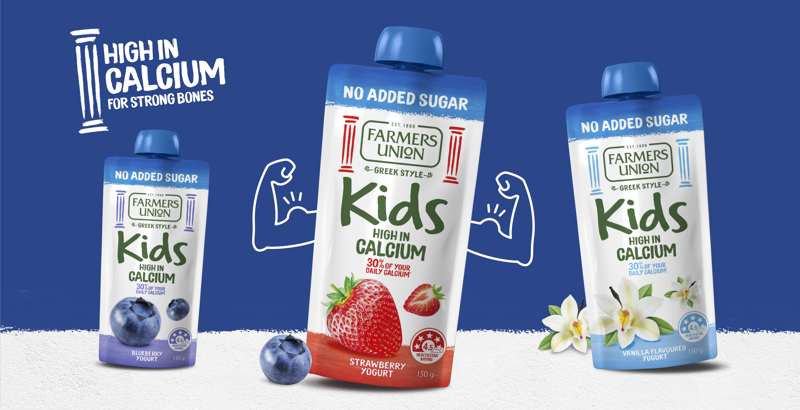
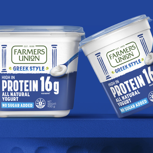
B! Brand refreshed Farmers Union Greek Style Yogurt, modernising its identity while preserving trust and recognition. The iconic Greek Style logo and pillars were softened with a painterly style and product imagery amplified appetite appeal creating a consistent, natural and contemporary tone across the core range and new formats.
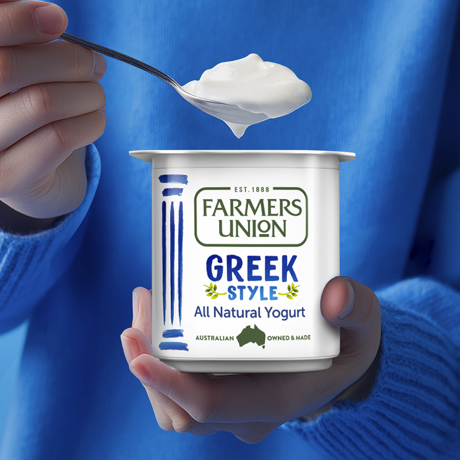

Using our brand building blocks we leveraged Farmers Union Greek Style Yogurt’s distinctive visual heritage and developed refreshed assets unique to the evolving needs of the Greek yogurt category:
B Clear
We modernised the packaging to highlight the brand’s focus on taste and quality, ensuring strong on-shelf recognition and clarity for consumers.
B Relevant
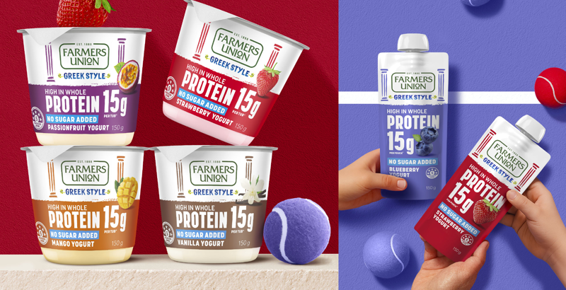
By introducing real product imagery, we enhanced appetite appeal while reinforcing Farmers Union’s trusted heritage and connecting with consumers’ needs for authenticity and versatility.
B Consistent
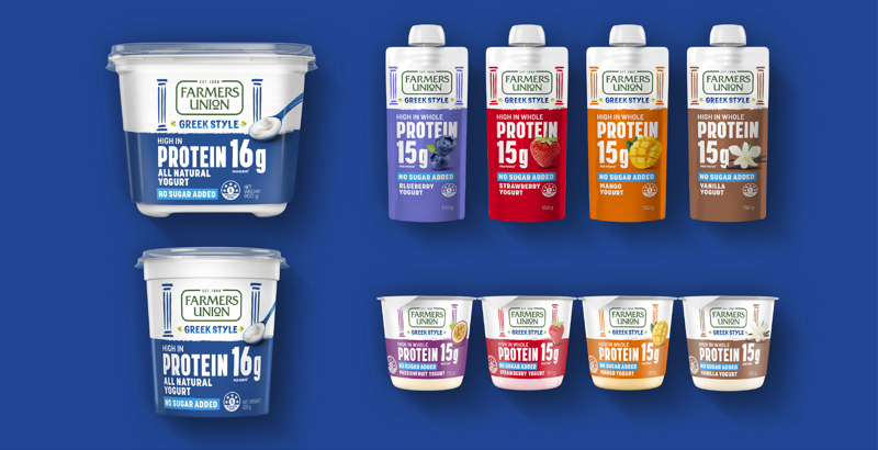
We evolved Farmers Union’s visual identity with a unified, modern style, ensuring consistency of key brand assets across all ranges and formats — strengthening recognition, cohesion and consumer trust.
